

CRO Insights #20 📈
Sit back 🪑
Roll a joint 🥦
And let me break down exactly how we plan to increase our clients conversion rates with this redesign of their product page.
Let's begin...
🧵
Sit back 🪑
Roll a joint 🥦
And let me break down exactly how we plan to increase our clients conversion rates with this redesign of their product page.
Let's begin...
🧵
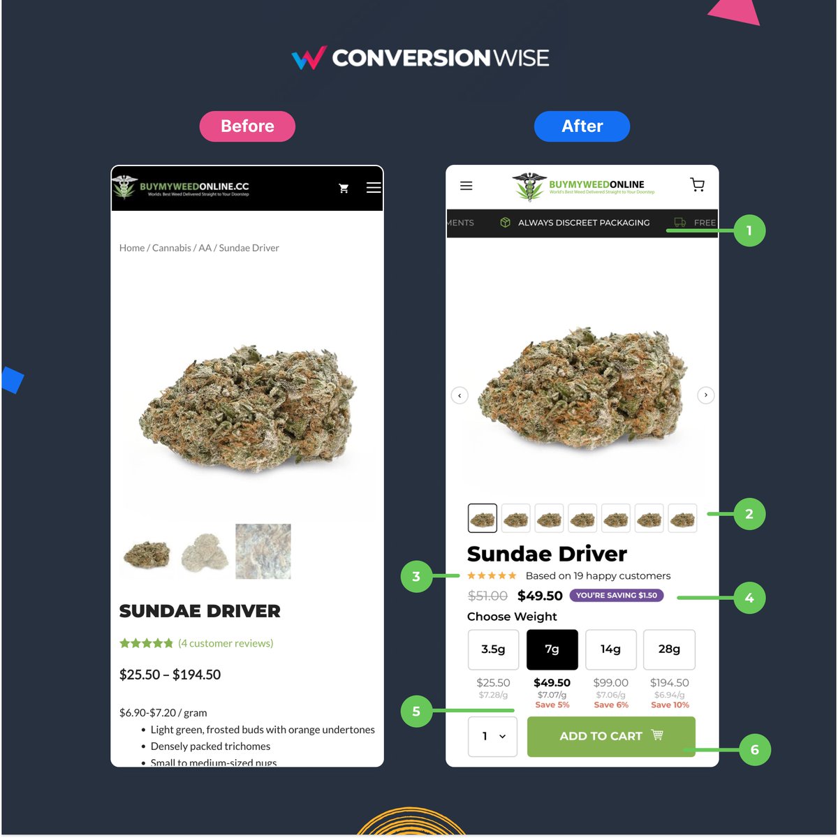
1. We've added trust directly under the navigation
❌ Before: Buying weed online is a very new thing, therefore it's imperative that people trust the process.
✅ After: We've help to add that instantly by showing a trust notice bar that displays our trust policies under the nav
❌ Before: Buying weed online is a very new thing, therefore it's imperative that people trust the process.
✅ After: We've help to add that instantly by showing a trust notice bar that displays our trust policies under the nav
2. We've improved the spacing and UI/UX of images
❌ Before: There's way too much white space pushing down really important elements on mobile view.
✅ After: We've optimised the top section, removing breadcrumbs, white space and improving the image slider user experience.
❌ Before: There's way too much white space pushing down really important elements on mobile view.
✅ After: We've optimised the top section, removing breadcrumbs, white space and improving the image slider user experience.
3. We've enhanced the social proof
❌ Before: The social proof was fine but we've been able to enhance it further.
✅ After: By simply moving it further up the fold and add "Happy customers" to the end of the wording we've created a more appealing social proof section.
❌ Before: The social proof was fine but we've been able to enhance it further.
✅ After: By simply moving it further up the fold and add "Happy customers" to the end of the wording we've created a more appealing social proof section.
4. We've added a dynamic savings label
❌ Before: The price range was way too wide, people didn't really know how much they were paying.
✅ After: By breaking down each amount into clear and obvious options we can also dynamically update the price/strikethrough and savings.
❌ Before: The price range was way too wide, people didn't really know how much they were paying.
✅ After: By breaking down each amount into clear and obvious options we can also dynamically update the price/strikethrough and savings.
5. We've added the savings to each weight
❌ Before: The savings weren't visible to the potential buyer.
✅ After: Now, there's a clear visual that showcases the value of buying more weed upfront. This clearly makes people want to save and therefore should increase AOV.
❌ Before: The savings weren't visible to the potential buyer.
✅ After: Now, there's a clear visual that showcases the value of buying more weed upfront. This clearly makes people want to save and therefore should increase AOV.
6. We've pushed the ATC button above the fold
❌ Before: The add to cart button was way down the fold without a clear pricing matrix.
✅ After: Instead, we've redesigned the pricing table to showcase the different options, savings and added an easy add to cart button.
❌ Before: The add to cart button was way down the fold without a clear pricing matrix.
✅ After: Instead, we've redesigned the pricing table to showcase the different options, savings and added an easy add to cart button.
TL;DR
🚀 Add a trust policy notice bar
🚀 Reduce white space on mobile
🚀 Add "happy customers" to social proof
🚀 Show the savings dynamically on select
🚀 Always showcase the savings per option
🚀 Push your call to actions above the fold
🚀 Add a trust policy notice bar
🚀 Reduce white space on mobile
🚀 Add "happy customers" to social proof
🚀 Show the savings dynamically on select
🚀 Always showcase the savings per option
🚀 Push your call to actions above the fold
That's all from todays CRO Insights 📈.
If you enjoyed this thread:
1. Follow me @oliverkenyon for more conversion rate tips
2. RT the first tweet to share this thread with your audience
Thank you so much 🙏
If you enjoyed this thread:
1. Follow me @oliverkenyon for more conversion rate tips
2. RT the first tweet to share this thread with your audience
Thank you so much 🙏
Loading suggestions...