

#trading explained easy for inexperienced -->
how to read a stock chart 🧵👇
how to read a stock chart 🧵👇
1/8
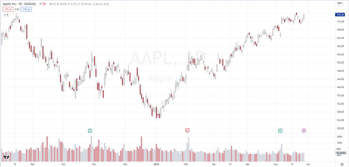
Stock bar charts display price movements over time.
Each bar represents a specific time period (e.g. a day, as in the previous tweet chart) and shows the stock's opening, closing, highest, and lowest prices during that period.
Stock bar charts display price movements over time.
Each bar represents a specific time period (e.g. a day, as in the previous tweet chart) and shows the stock's opening, closing, highest, and lowest prices during that period.
2/8
The body of the candle represents the price range between the opening and closing prices.
A filled (colored) body indicates a price decrease, while an empty (white or green) body represents a price increase.
The body of the candle represents the price range between the opening and closing prices.
A filled (colored) body indicates a price decrease, while an empty (white or green) body represents a price increase.
3/8
The upper shadow (wick) of the candle extends from the top of the body and represents the highest price reached during the time period.
The lower shadow extends from the bottom of the body and represents the lowest price.
The upper shadow (wick) of the candle extends from the top of the body and represents the highest price reached during the time period.
The lower shadow extends from the bottom of the body and represents the lowest price.
4/8
Long candles indicate significant price movements, while short candles represent relatively small changes.
Pay attention to candles with unusual lengths, as they may indicate important events or market reactions.
Long candles indicate significant price movements, while short candles represent relatively small changes.
Pay attention to candles with unusual lengths, as they may indicate important events or market reactions.
6/8
Candlestick patterns provide insights into potential market reversals or continuations.
Examples include doji (indicating indecision), hammer (bullish reversal), and shooting star (bearish reversal). Learn these patterns to enhance your analysis.
Candlestick patterns provide insights into potential market reversals or continuations.
Examples include doji (indicating indecision), hammer (bullish reversal), and shooting star (bearish reversal). Learn these patterns to enhance your analysis.
7/8
Volume bars are often shown beneath the price candles and represent the trading volume during each time period.
High volume can indicate increased market interest and potentially stronger price movements.
Volume bars are often shown beneath the price candles and represent the trading volume during each time period.
High volume can indicate increased market interest and potentially stronger price movements.
8/8
Different chart intervals (e.g., daily, weekly, monthly) provide varying levels of detail.
Shorter intervals may help with short-term trading decisions, while longer intervals can reveal long-term trends.
Different chart intervals (e.g., daily, weekly, monthly) provide varying levels of detail.
Shorter intervals may help with short-term trading decisions, while longer intervals can reveal long-term trends.
Loading suggestions...