

💡 Stop using hex # codes or RGB values in your designs!
You can 10x your design skills, choose better colours and ensure accessibility for your users, simply by using the HSL scale.
Let's learn about HSL in this thread 🧵
You can 10x your design skills, choose better colours and ensure accessibility for your users, simply by using the HSL scale.
Let's learn about HSL in this thread 🧵
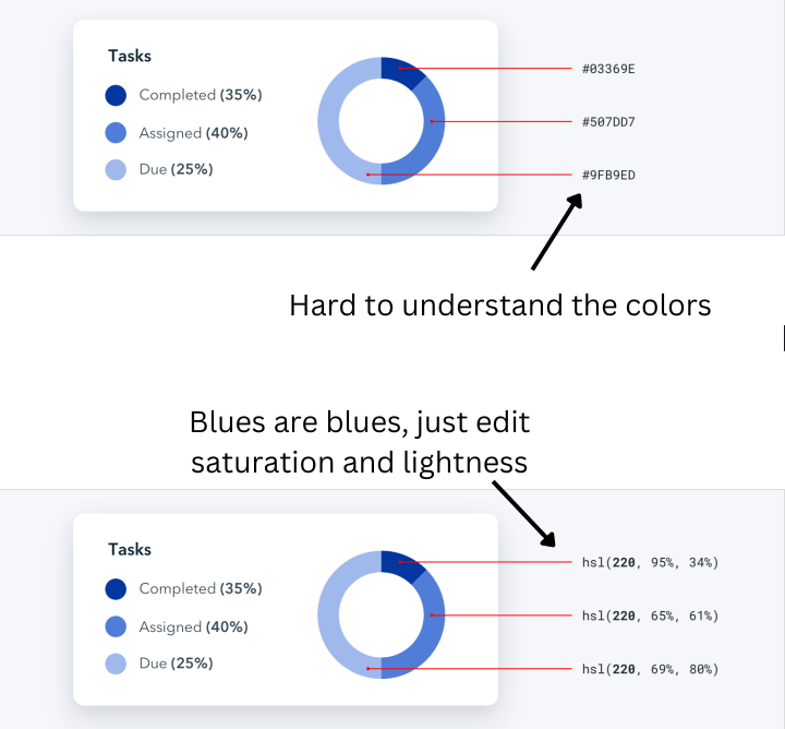
The problem with RGB and hex codes -
It is very difficult to determine which color it is just by looking at the hex number / RGB values.
This can get confusing, and you'll need to use the color picker again and again to choose a good color.
It is very difficult to determine which color it is just by looking at the hex number / RGB values.
This can get confusing, and you'll need to use the color picker again and again to choose a good color.
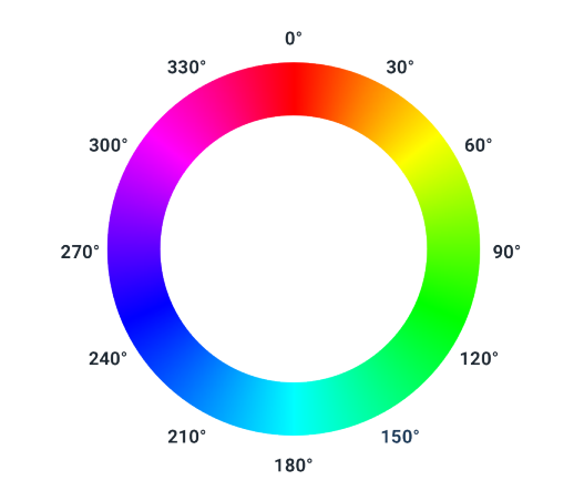
HSL stands for
Hue: The colour itself - all shades of 'blue' have the hue 220
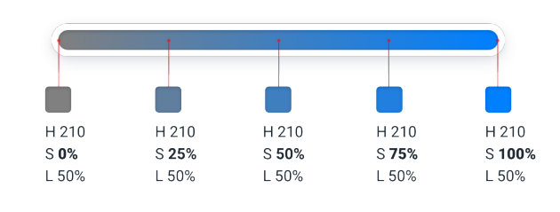
Saturation - Amount of 'paint' poured into the pallete - less paint makes it dull, more makes it more vibrant
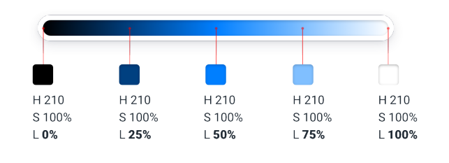
Lightness - The amount of light that falls upon the paint
Hue: The colour itself - all shades of 'blue' have the hue 220
Saturation - Amount of 'paint' poured into the pallete - less paint makes it dull, more makes it more vibrant
Lightness - The amount of light that falls upon the paint
Let's learn about Hue. Hue is measured in Degrees
This means that you simply need to remember some degrees to be able to simply choose colours "from the air"
This is a really cool power to have - and you can do some magic with it!
This means that you simply need to remember some degrees to be able to simply choose colours "from the air"
This is a really cool power to have - and you can do some magic with it!
Saturation:
Basically, it is the "amount of paint" - less will become dull, grayish and more will become vibrant and intense
Basically, it is the "amount of paint" - less will become dull, grayish and more will become vibrant and intense
And lightness - amount of light!
Now here's how you can make your designs more accessible:
Your designs should be compliant with the Web Content Accessibility Guidelines (WCAG) - Which means that text should atleast have a contrast ratio of 4.5:1,
Your designs should be compliant with the Web Content Accessibility Guidelines (WCAG) - Which means that text should atleast have a contrast ratio of 4.5:1,
Rotate the hue 180 degrees to right or left to create a perfectly contrasting background (since it's opposite in the wheel)
To make a color lighter or darker without losing the "pop" - rotate it slighly towards the ligher/darker part of the color (but dont go furthur than 30)
To make a color lighter or darker without losing the "pop" - rotate it slighly towards the ligher/darker part of the color (but dont go furthur than 30)
That's a wrap! We learnt:
- Use HSL color
- What is HSL
- How to use HSL
I've been taking design a bit seriously and learning more about it, so I'll keep sharing my learnings.
If you liked this thread, do follow me for more!
- Use HSL color
- What is HSL
- How to use HSL
I've been taking design a bit seriously and learning more about it, so I'll keep sharing my learnings.
If you liked this thread, do follow me for more!
Loading suggestions...