

Have you ever tried making your website font look exactly like that of Tailwind CSS official website and failed, despite using the same Inter font and styles?
Compare and observe what's different in the screenshots below.
Read more to learn how to turn the bottom one into top.
Compare and observe what's different in the screenshots below.
Read more to learn how to turn the bottom one into top.

The main difference is in the letter "a". The one on the Tailwind website is called a "single-storey 'a'". That's what gives the look you need.
So why is that letter different though you're using the same font?
Because they're using the "variable" Inter font.
Contd..
So why is that letter different though you're using the same font?
Because they're using the "variable" Inter font.
Contd..
Variable fonts allow for a greater degree of customization than static ones. Within a single font file you have multiple font display options.
On the official site, the font used is Inter variable with a font feature setting that changes the appearance of 'a'.
How is it done?
On the official site, the font used is Inter variable with a font feature setting that changes the appearance of 'a'.
How is it done?
First download Inter from rsms.me
(Google fonts will not work)
You'll find an "Inter web" folder within it. Copy two files ending with "...var.woff2", along with the other font weights you need into your project (Others are needed as fallback for older browsers)
(Google fonts will not work)
You'll find an "Inter web" folder within it. Copy two files ending with "...var.woff2", along with the other font weights you need into your project (Others are needed as fallback for older browsers)

You'll also see an "inter.css" file in the same folder. Refer to that file to add the font faces in your CSS file (Tailwind CSS input file).
Make sure to edit the url to include the correct path
Make sure to edit the url to include the correct path

Then you just need to set the property `font-feature-settings` to "cv11" to get a single-storey 'a'.
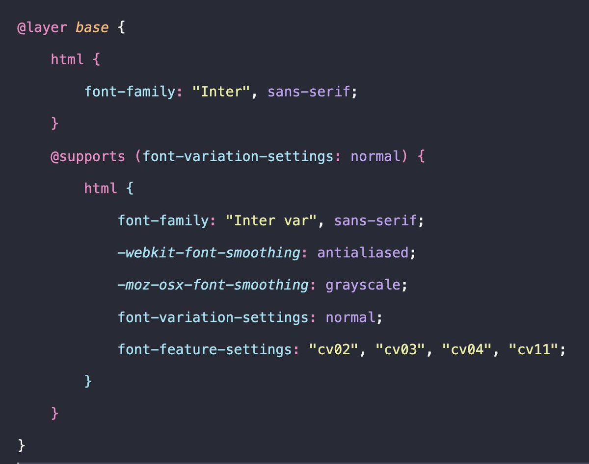
If you want the exact font feature settings as that of Tailwind website, use these CSS rules.
Use the regular Inter font for browsers that don't support variable fonts yet.
If you want the exact font feature settings as that of Tailwind website, use these CSS rules.
Use the regular Inter font for browsers that don't support variable fonts yet.
I'm not an expert at fonts and stuff. It's my recent finding, so I shared what I learnt. Feel free to correct me if there's a mistake anywhere.
Thank you for reading :) Share it ahead if you learnt something!
Thank you for reading :) Share it ahead if you learnt something!
And if you like to play around with Inter's variable font settings to see what each of them mean, here's a lab:
rsms.me
rsms.me
Loading suggestions...