

🧵1/10
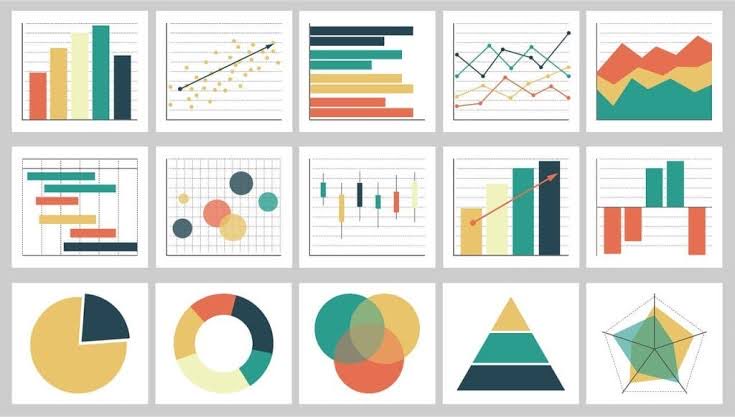
When visualizing data, the type of plot you choose can make all the difference. Let's explore how to pick the right plot using #ggplot2 in #RStats. #DataScience
When visualizing data, the type of plot you choose can make all the difference. Let's explore how to pick the right plot using #ggplot2 in #RStats. #DataScience
🧵2/10
Histograms: Great for understanding the distribution of single variables.
ggplot(data, aes(x=variable)) + geom_histogram()
#DataScience #RStats
Histograms: Great for understanding the distribution of single variables.
ggplot(data, aes(x=variable)) + geom_histogram()
#DataScience #RStats

🧵3/10
Scatter Plots: Perfect for exploring relationships between two continuous variables.
ggplot(data, aes(x=var1, y=var2)) + geom_point()
#DataScience #RStats
Scatter Plots: Perfect for exploring relationships between two continuous variables.
ggplot(data, aes(x=var1, y=var2)) + geom_point()
#DataScience #RStats

🧵4/10
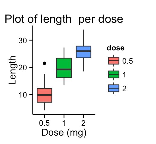
Boxplots: Compare distributions between different categories effortlessly.
ggplot(data, aes(x=factor_var, y=continuous_var)) + geom_boxplot()
#DataScience #RStats
Boxplots: Compare distributions between different categories effortlessly.
ggplot(data, aes(x=factor_var, y=continuous_var)) + geom_boxplot()
#DataScience #RStats
🧵5/10
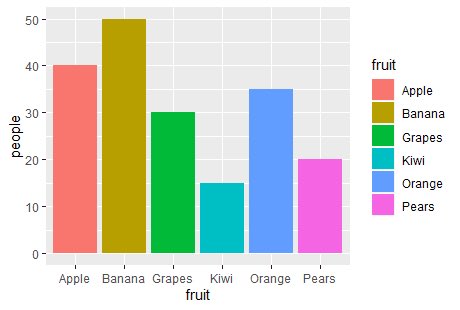
Bar Charts: Visualize the frequencies of categorical variables effectively.
ggplot(data, aes(x=factor_var)) + geom_bar()
#DataScience #RStats
Bar Charts: Visualize the frequencies of categorical variables effectively.
ggplot(data, aes(x=factor_var)) + geom_bar()
#DataScience #RStats
🧵6/10
Line Charts: Ideal for time series or sequential data visualization.
ggplot(data, aes(x=time_var, y=continuous_var)) + geom_line()
#DataScience #RStats
Line Charts: Ideal for time series or sequential data visualization.
ggplot(data, aes(x=time_var, y=continuous_var)) + geom_line()
#DataScience #RStats

🧵7/10
Facets: Break down visualizations by categories for deeper insights.
ggplot(data, aes(x=var1, y=var2)) + geom_point() + facet_wrap(~factor_var)
#DataScience #RStats
Facets: Break down visualizations by categories for deeper insights.
ggplot(data, aes(x=var1, y=var2)) + geom_point() + facet_wrap(~factor_var)
#DataScience #RStats

🧵8/10
Remember: Beyond the plot type, customize your graphs. Titles, axis labels, and themes can enhance clarity and aesthetics.
#DataScience #RStats
Remember: Beyond the plot type, customize your graphs. Titles, axis labels, and themes can enhance clarity and aesthetics.
#DataScience #RStats
🧵9/10
Always ponder:
•What story does my data tell?
•What patterns am I keen to explore?
•Your answers will guide your plot choice. #DataScience #RStats
Always ponder:
•What story does my data tell?
•What patterns am I keen to explore?
•Your answers will guide your plot choice. #DataScience #RStats
🧵10/10
Visualization is about clarity and communication. Make your data sing its song with the right plots in #ggplot2. #DataScience #RStats
Visualization is about clarity and communication. Make your data sing its song with the right plots in #ggplot2. #DataScience #RStats
Loading suggestions...