

9 designs tip to turn your newsletter into an eye-catching masterpiece:
(A visual thread)
(A visual thread)
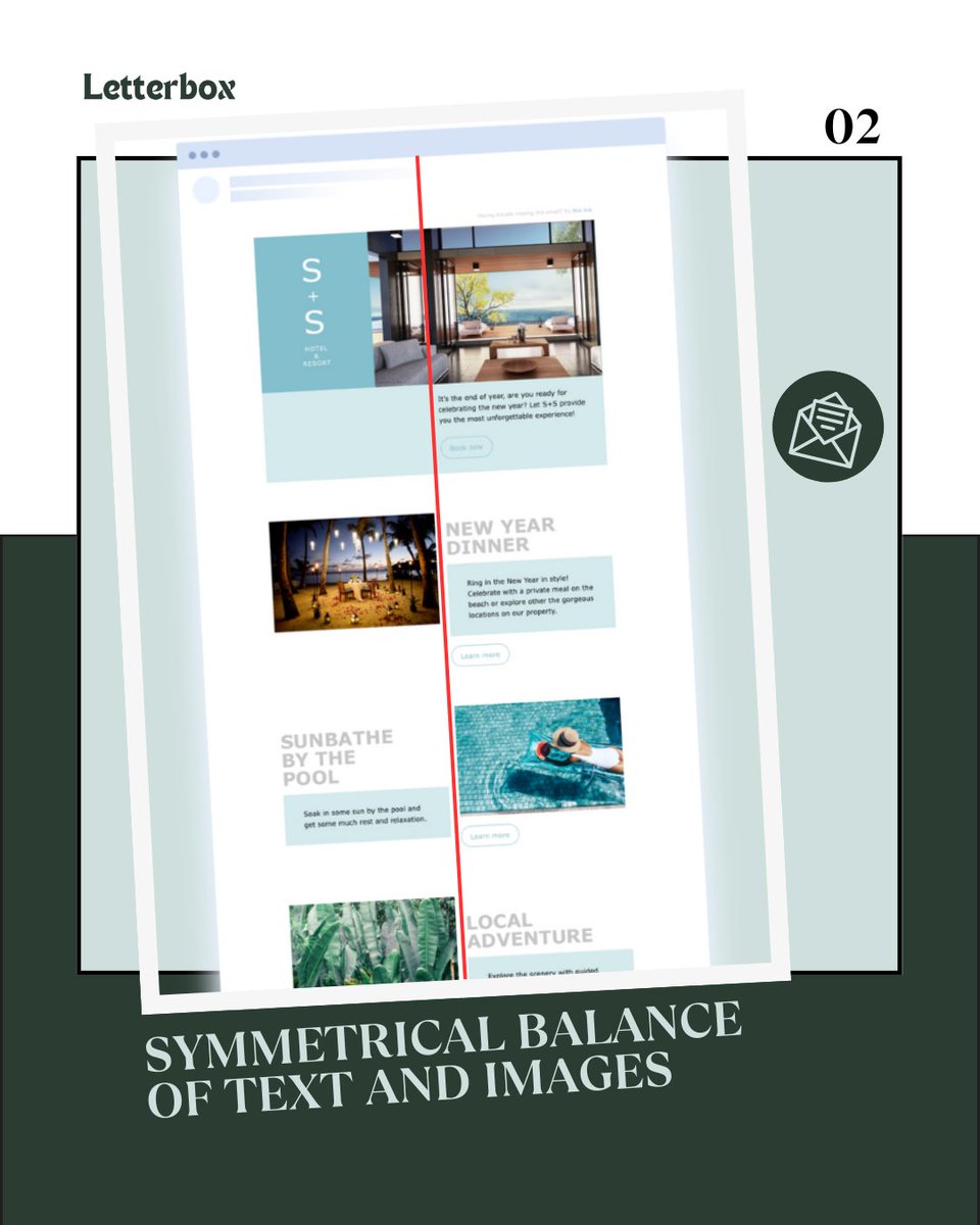
Tip-1
Create Balance in newsletter design
Create Balance in newsletter design
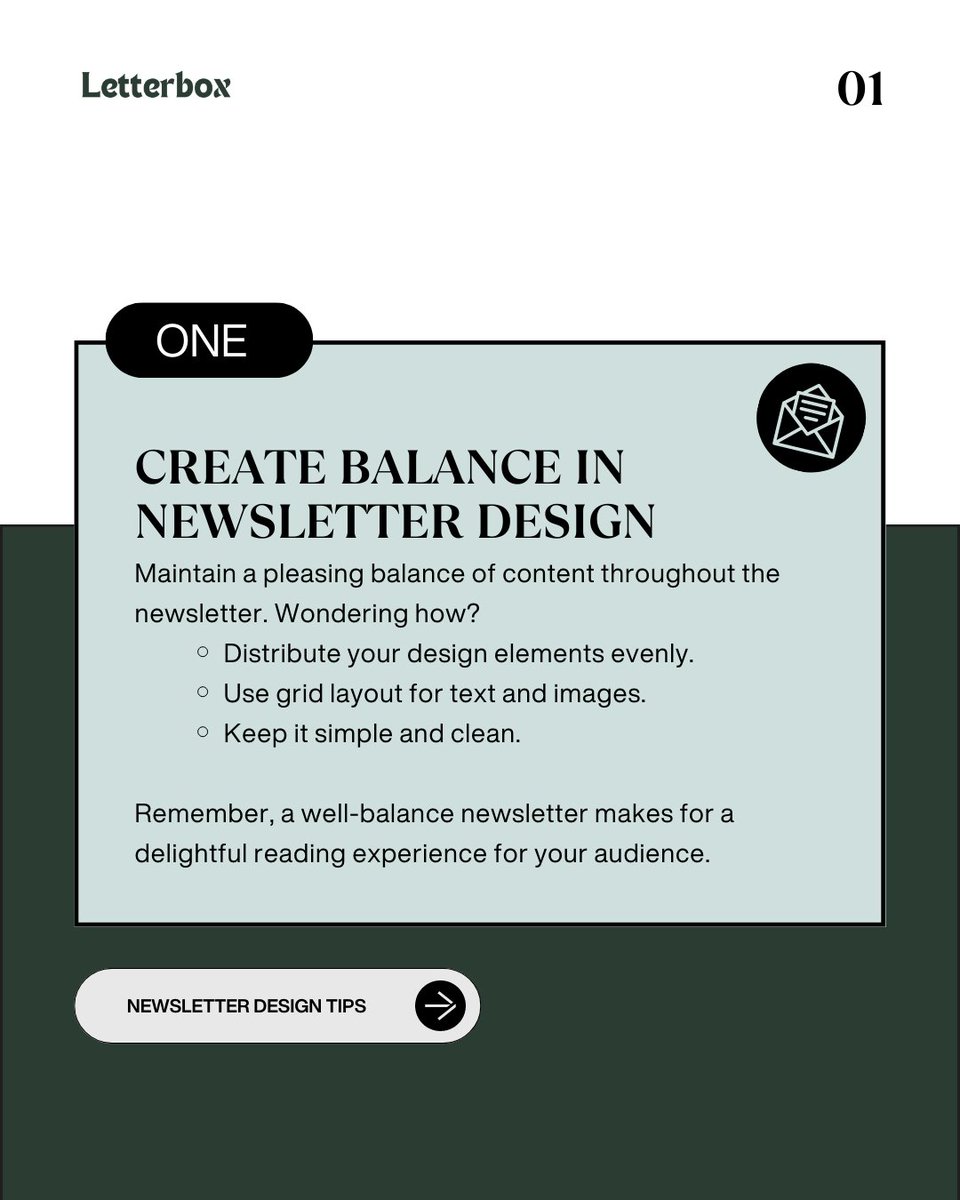
Here is an example for creating balance in your newsletter design:

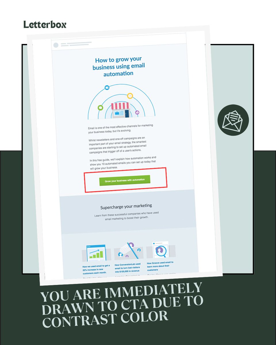
Tip-2
Emphasize with contrast
Emphasize with contrast
Which element is drawing your attention?
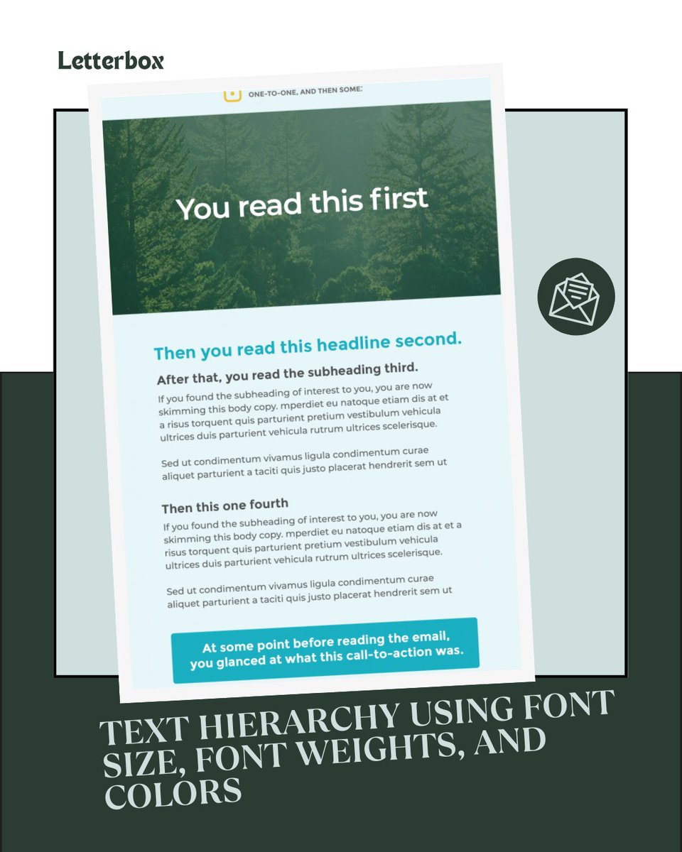
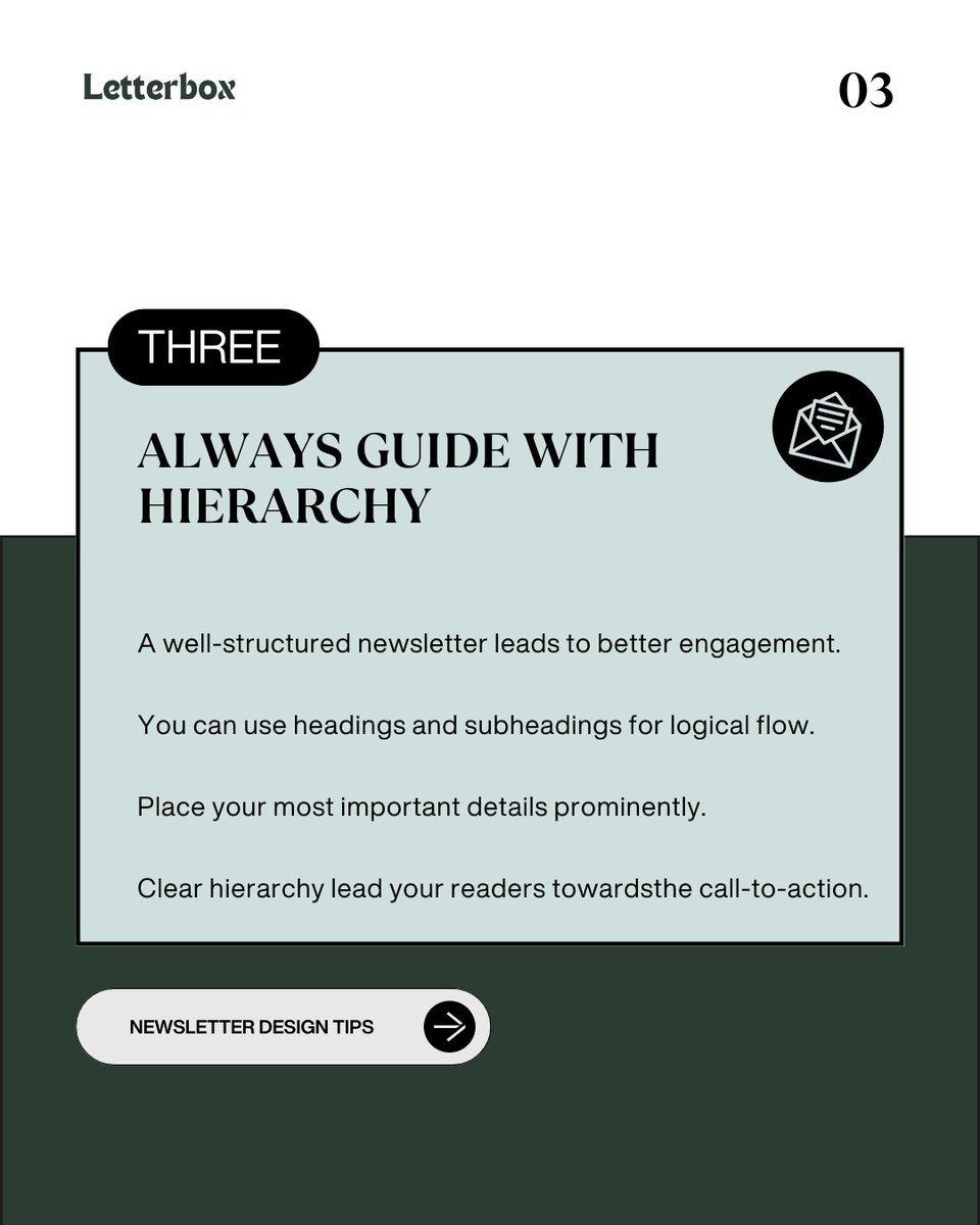
Tip-3
Guide with hierarchy
Guide with hierarchy

See how the different text sizes are used to define the text hierarchy.
Tip-4
Harmonize with repetition
Harmonize with repetition
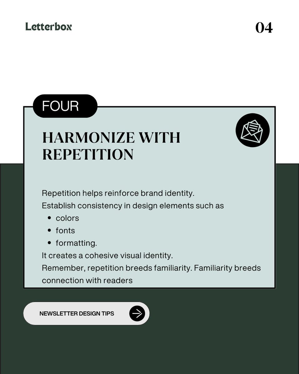
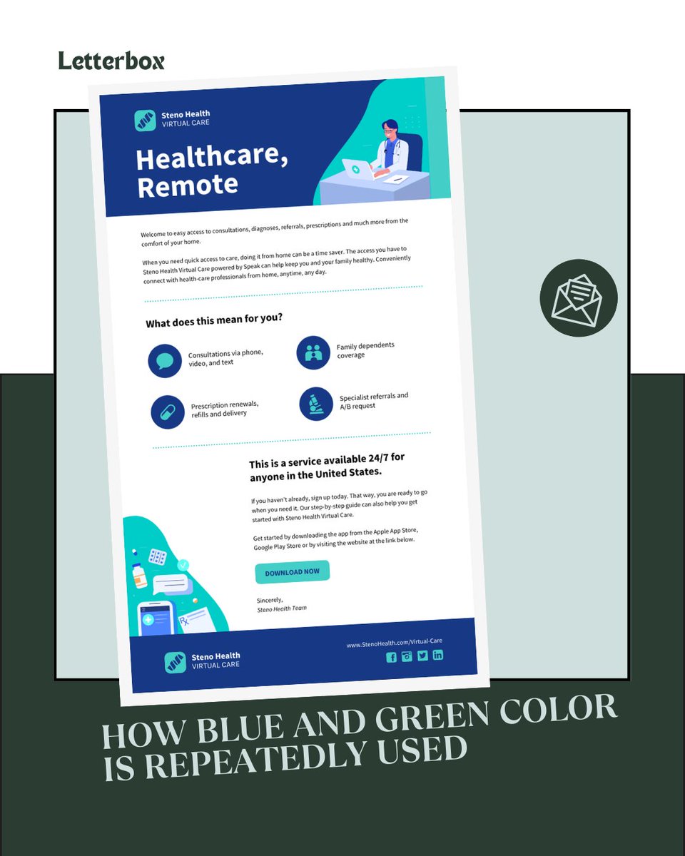
Example of using repetition in your newsletter design:
Tip-5
Align for visual precision
Align for visual precision
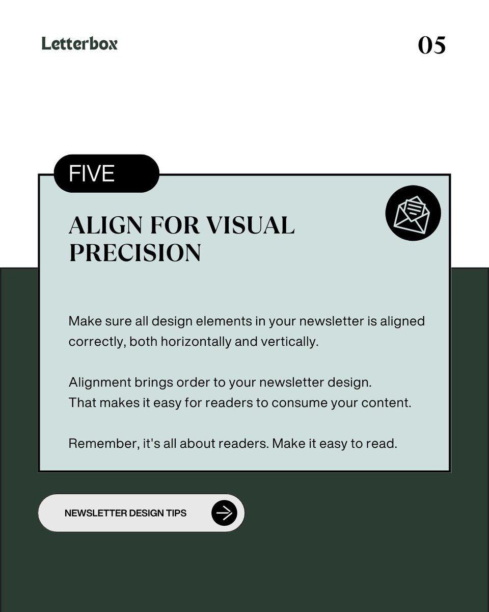
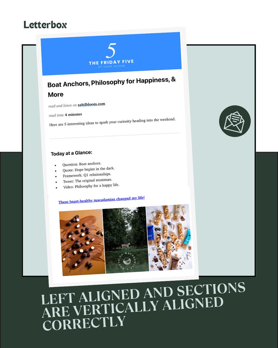
Great example here. You can align and use spacing to make your newsletter appealing.
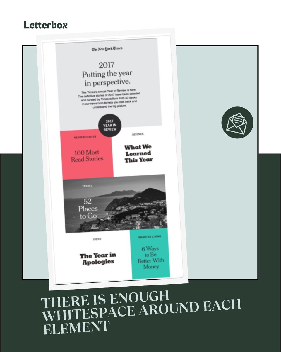
Tip -6
Embrace whitespace
Embrace whitespace
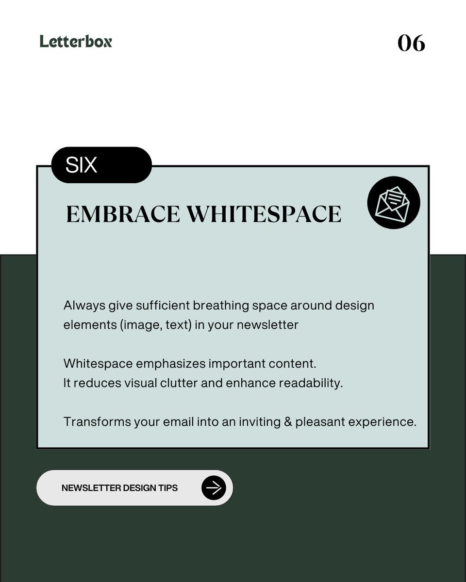
Whitespace always highlights the key elements in your design.
Tip-7
Typography (font) matters
Typography (font) matters
Example of using fonts to make your newsletter engaging.
Tip-8
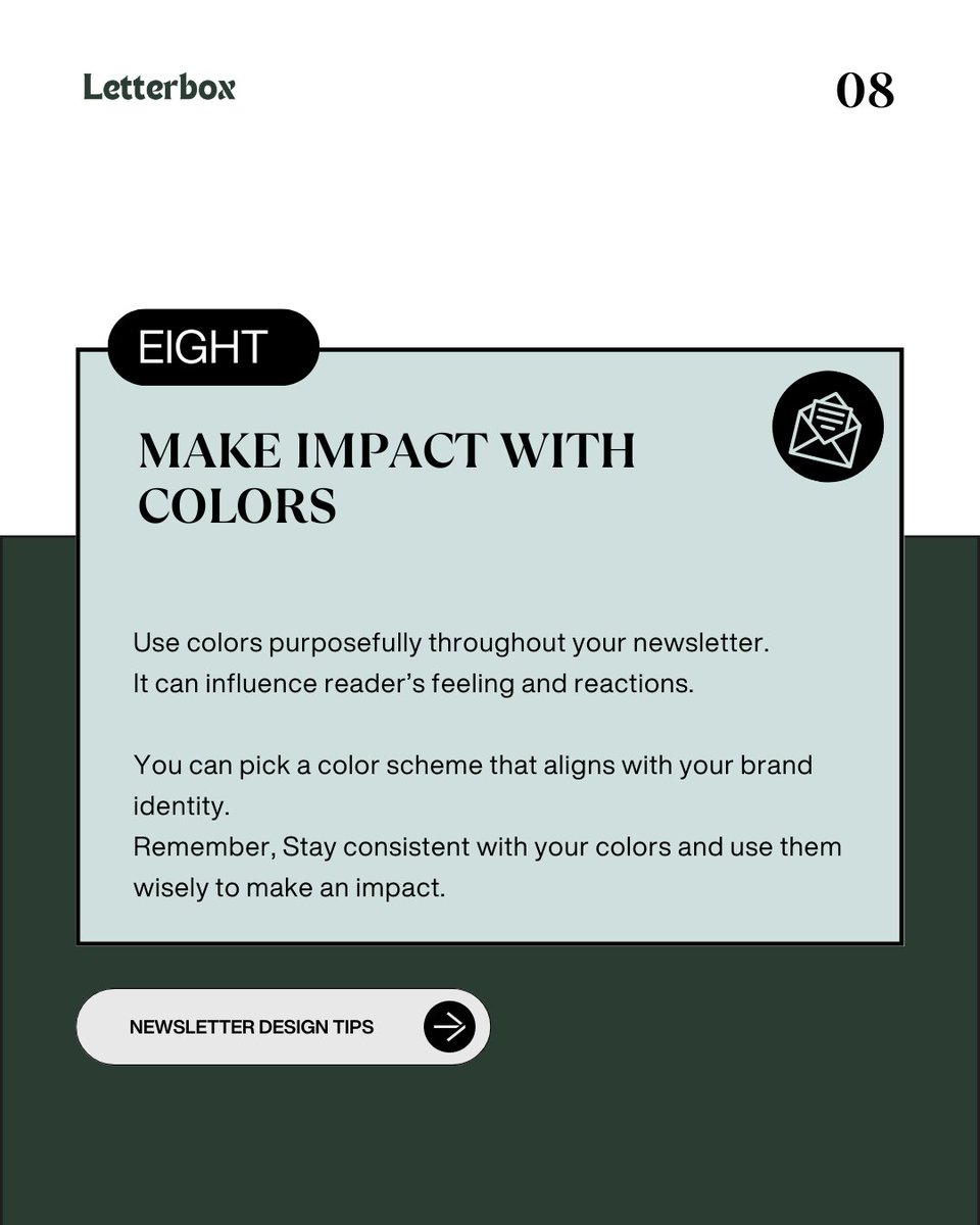
Make Impact with colors
Make Impact with colors
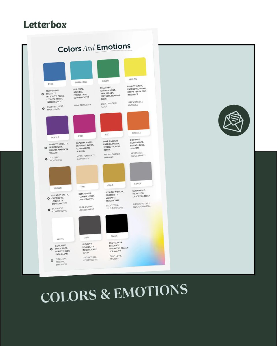
Use this color guide for knowing the emotions various colors evoke.
Tip-9
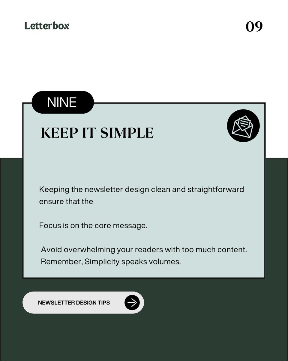
Keep it simple.
Keep it simple.
If you are interested in boosting your newsletter design game.
I just launched a newsletter design agency - "Letterbox" for @beehiiv
Let's work together and build a newsletter that your customers will want to read.
letterbox.co.in
I just launched a newsletter design agency - "Letterbox" for @beehiiv
Let's work together and build a newsletter that your customers will want to read.
letterbox.co.in

@beehiiv That's it!
Hope you find this hyper-visual helpful.
Follow @sachinramje for more content on Design, Newsletters, Canva and Hyper-visuals.
RT to share this thread with your audience.
Hope you find this hyper-visual helpful.
Follow @sachinramje for more content on Design, Newsletters, Canva and Hyper-visuals.
RT to share this thread with your audience.
Loading suggestions...