Josh (Your CFO Guy)
Josh (Your CFO Guy)

@YourCFOGuy

13 Tweets 7 reads Aug 13, 2023
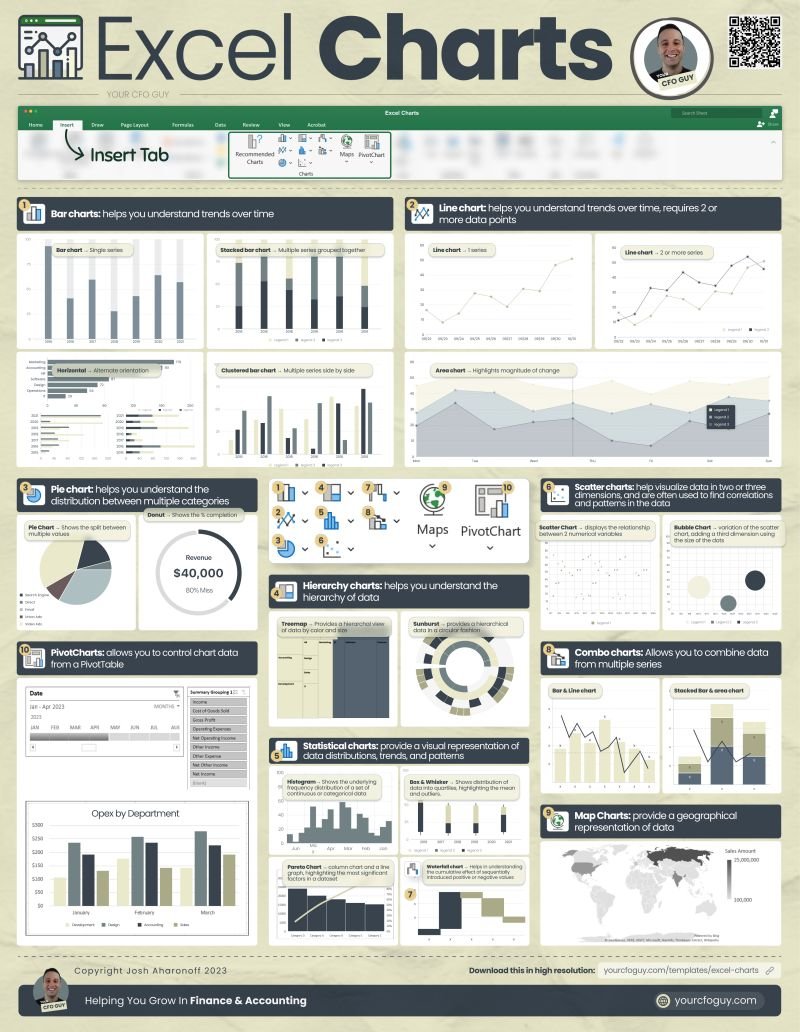
๐—˜๐˜ƒ๐—ฒ๐—ฟ๐˜† ๐—˜๐˜…๐—ฐ๐—ฒ๐—น ๐—–๐—ต๐—ฎ๐—ฟ๐˜, ๐—ฎ๐—ป๐—ฑ ๐—ช๐—ต๐—ฒ๐—ป ๐˜๐—ผ ๐—จ๐˜€๐—ฒ ๐—ถ๐˜ ๐Ÿ“Š๐Ÿ“ˆ
Charts are one of the most powerful features that Excel offersโ€ฆ
and each one has their own time & place for when you should use them.
Letโ€™s do a walk through of each chart:๐Ÿงต
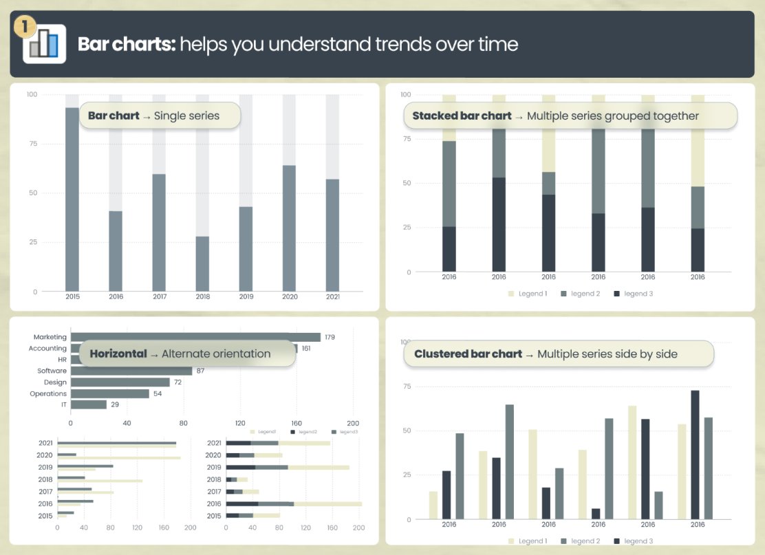
๐Ÿญ. ๐Ÿ“ŠBar charts โ†’ helps you understand trends over time.
โ€ข Bar chart โ†’ single series
โ€ข Stacked bar chart โ†’ multiple series grouped together
โ€ข Clustered bar chart โ†’ multiple series side by side
โ€ข Horizontal โ†’ alternate orientation
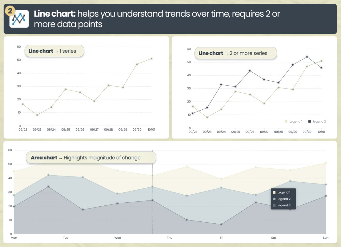
๐Ÿฎ. ๐Ÿ“ˆ Line chart โ†’ helps you understand trends over time, with a line
โ€ข Line chart โ†’ can show 1 or multiple series. I like to utilize 2 series when Iโ€™m trying to understand the intersection
โ€ข Area chart โ†’ highlights magnitude of change by shading the bottom
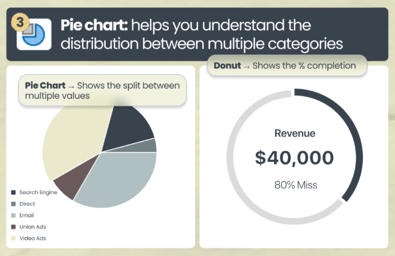
๐Ÿฏ. ๐ŸŸก Pie chart โ†’ helps you understand the distribution between multiple categories
โ€ข Pie Chart โ†’ shows the split / distribution between multiple categories
โ€ข Donut โ†’ shows the % completion. This is in essence a hollow pie chart (my favorite for budget vs actuals)
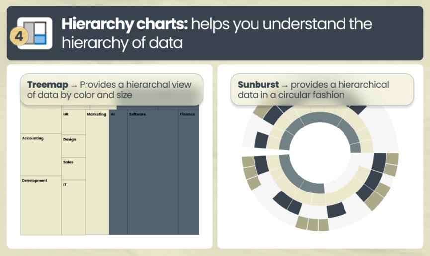
๐Ÿฐ. Hierarchy charts โ†’ helps you understand the hierarchy of data
โ€ข Treemap โ†’ provides a hierarchal view of data by color and size
โ€ข Sunburst โ†’ provides a hierarchical data in a circular fashion
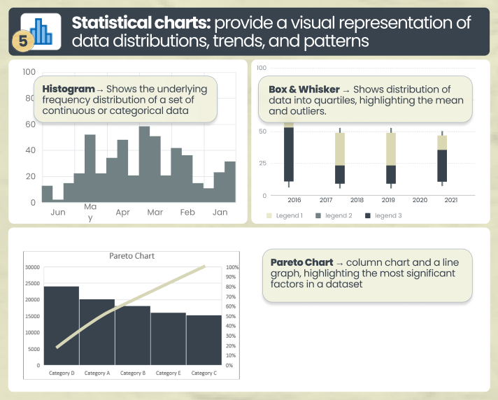
๐Ÿฑ. ๐Ÿ”ข Statistical charts โ†’ provide a visual representation of data distributions, trends, and patterns
โ€ข Histogram โ†’ Shows the underlying frequency distribution
โ€ข Box & Whisker โ†’ Shows distribution of data into quartiles, highlighting the mean and outliers.
โ€ข Pareto Chart โ†’ displays both the individual and cumulative frequencies
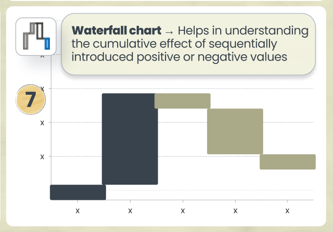
๐Ÿฒ. Waterfall chart โ†’ Helps in understanding the cumulative effect of sequentially introduced positive or negative values
This is especially relevant when showcasing MRR and ARR
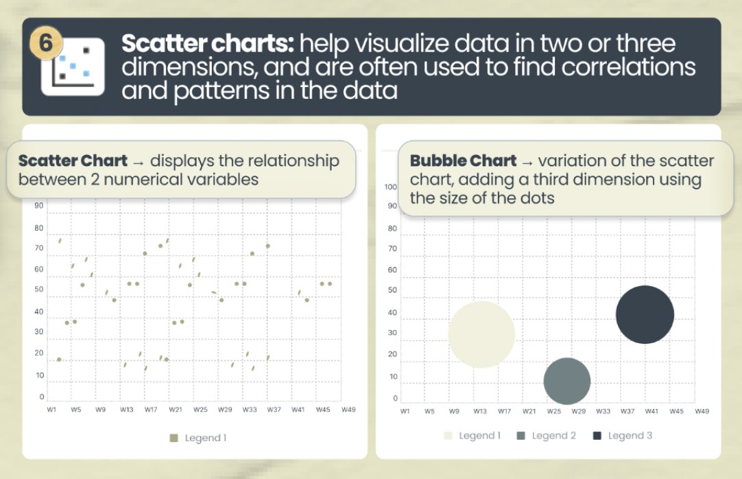
๐Ÿณ. Scatter charts โ†’ often used to find correlations and patterns in the data
โ€ข Scatter Chart โ†’ displays the relationship between 2 numerical variables
โ€ข Bubble Chart โ†’ variation of the scatter chart, adding a third dimension using the size of the dots.
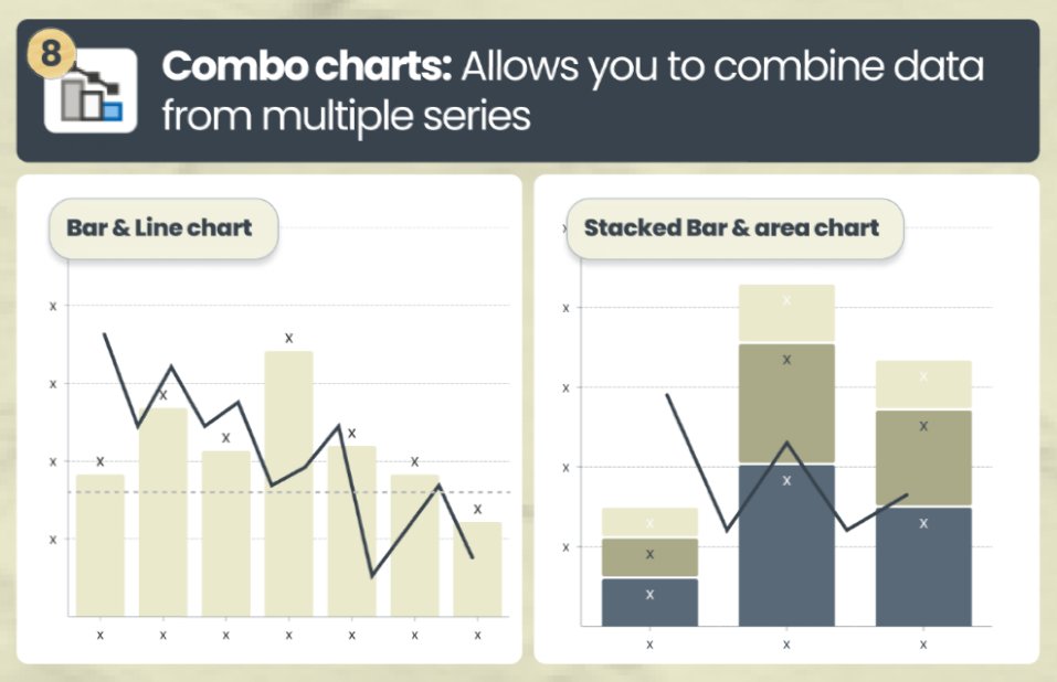
๐Ÿด. Combo charts โ†’ allows you to combine data from multiple series
Helpful when you have information across 2 distinct series (like Revenue and Gross Margin)
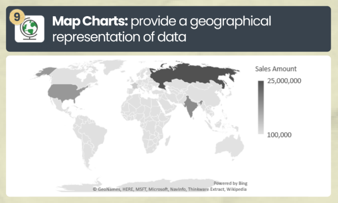
๐Ÿต. ๐Ÿ—บ๏ธ Map Charts โ†’ provide a geographical representation of data
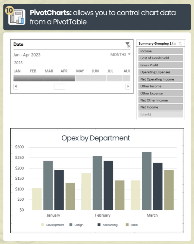
๐Ÿญ๐Ÿฌ. PivotCharts โ†’ allows you to control chart data from a PivotTable
And that's a wrap!
If you enjoyed this, consider:
1. Following me @YourCFOGuy
2. Joining my daily Finance & Accounting tips newsletter: yourcfoguy.com
3. RT for others

Loading suggestions...