


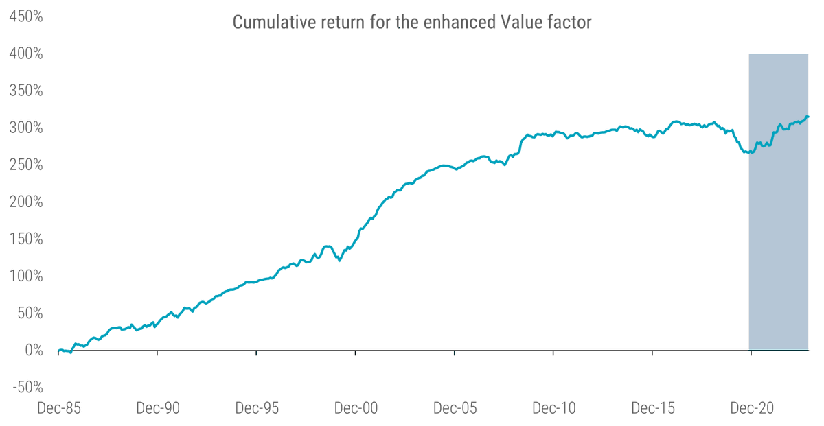
1. Long-term performance of the 'enhanced' value factor
The first chart illustrates the cumulative #performance of the #enhanced value strategy since 1986. Throughout this post, I define 'enhanced value' as we did in our paper Resurrecting the Value Premium (assets.ctfassets.net).
However, I focus on the pooled sample of developed and emerging markets to keep the analysis concise. Despite its solid long-term track record, the strategy also suffered between 2018 and 2020, as the value factor was the main cause of the so-called ‘quant crisis’ or ‘quant winter.’ However, the announcement of successful vaccine candidate results on 9 November 2020 triggered a new #spring for the value factor. This resulted in the long-awaited value comeback, which maintained traction in 2021 and 2022 and has continued through 2023 (see some comments regarding 2023 in point 9). Overall, the enhanced value factor has delivered attractive long-term returns despite the challenging period between 2018 and 2020. Please note that the grey-shaded area presents the out-of-sample data after posting the value paper on SSRN.
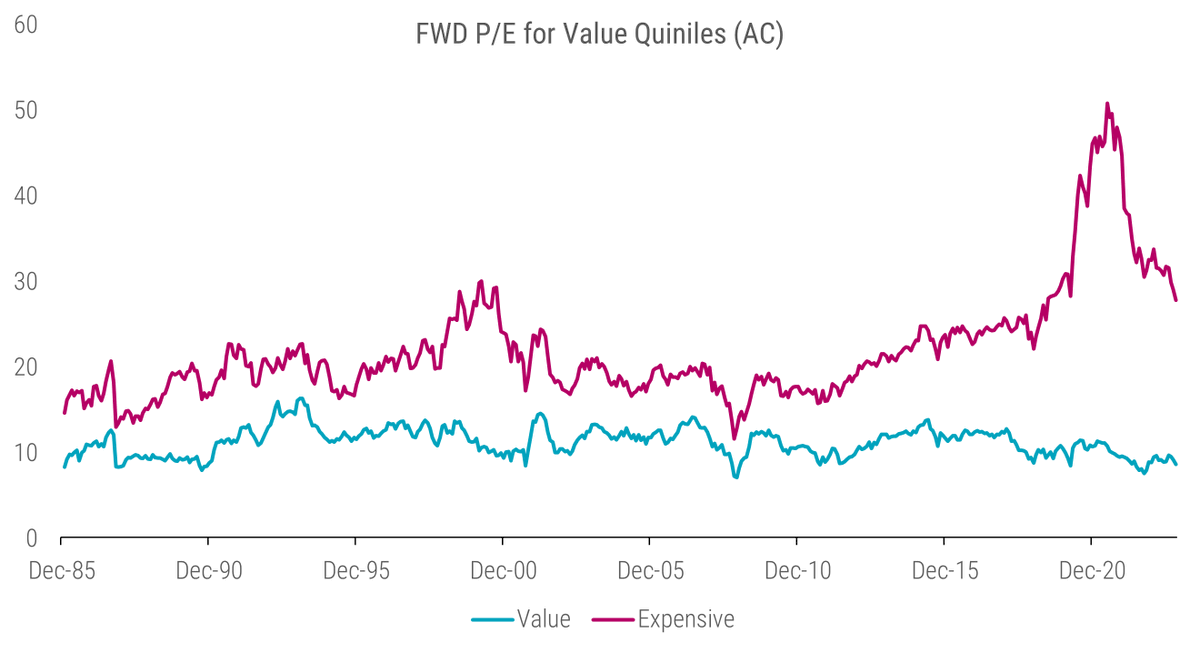
2. Valuation of value portfolios
So, what was the reason for the poor performance of value strategies between 2018 and 2020? The poor performance stemmed mainly from an extreme #widening of valuation multiples between growth and value stocks, with the former getting relatively more expensive. Before I dive into the value spread, i.e., the value of value, I want to show first the forward price-to-earnings (P/E) ratio of the cheapest and most expensive value portfolios over time.
While the median forward P/E of value stocks is around 11 and fluctuates between 8 and 14 most of the time, the median forward P/E of the most expensive stocks is around 20; however, it also reached levels of 30 during the dot-com bubble and even higher around 2020. Furthermore, one clearly sees that the spread in valuation between value and growth stocks substantially widened between 2018 and 2021 but has not fully normalized since then. This demonstrates that a substantial part of the outperformance of growth stocks during this period was not driven by increasing earnings but by multiple expansions.
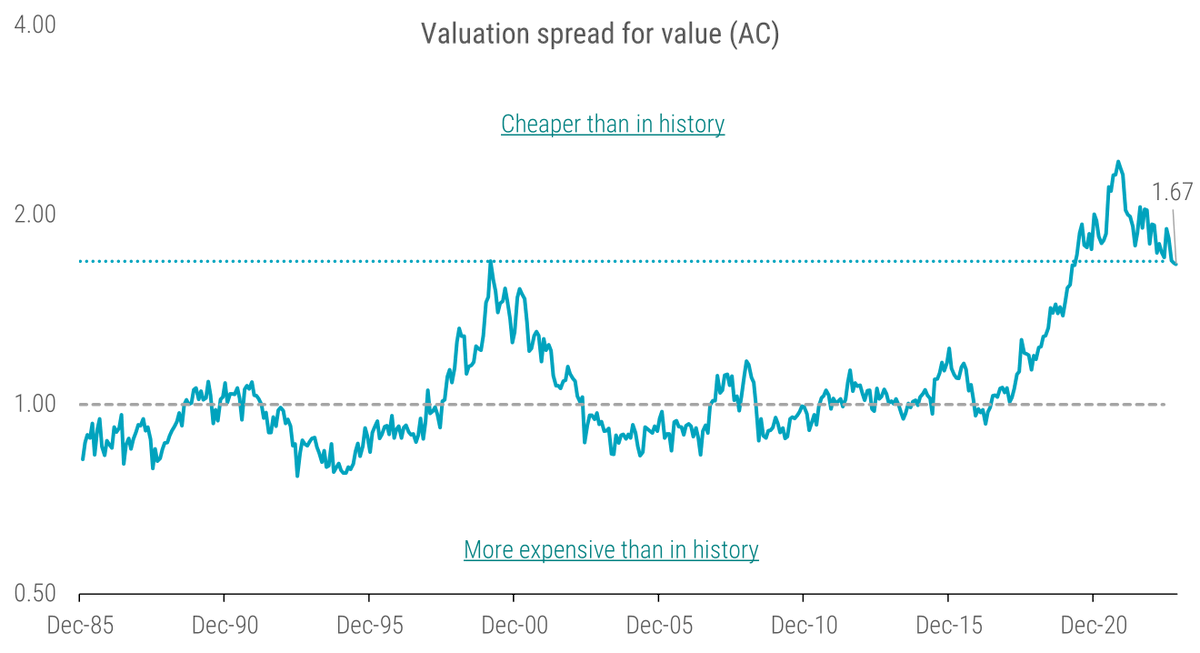
3. The value spread
When I take the ratio of valuation of the value and growth, I can quantify the valuation spread in one number per month. By deducing the time series median and taking the average over several valuation measures, I get a robust estimate of the abnormal valuation spread between value and growth. Consequently, a valuation spread above one indicates cheapness, while a reading below one implies that the factor is relatively expensive. The next chart shows the value spread over time.
Interestingly, the spread has only shrunk slightly over the last two years. More specifically, it is still wider at the end of October 2023 than it was at the beginning of the value winter in 2018. To put things into perspective, the current spread is about as wide as it was at the peak of the dot-com bubble in 2000.
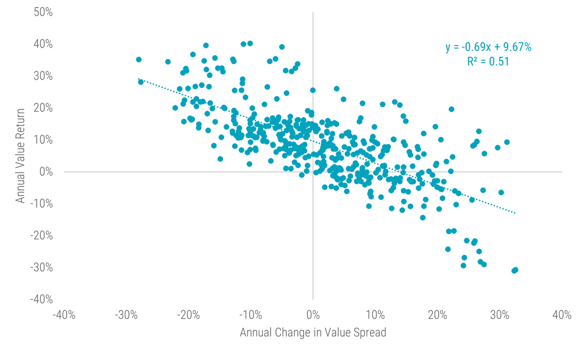
4. Value returns vs. value spreads
Why is it that despite a recent recovery in value, these stocks are still trading at a considerable discount compared to their 2018 levels? While changes in the value spread account for a significant part of the returns, they don't explain the entire picture. Other factors – such as carry (+), portfolio migration (+), and change in fundamentals (+ or - ) – also contribute to what I call the 'structural alpha', a more stable component of returns. In contrast, the revaluation alpha stems from changes in the value spread.
The next chart illustrates the relationship between continuously compounded annual value returns and annual changes in the log value spread. We observe a robust negative relationship between value returns and changes in the value spread, with the latter accounting for roughly 50% of the variation in the former. Crucially, I also document a high intercept of almost 10%. This can be interpreted as a cleaner estimate of the value premium for a hypothetical long-minus-short value factor, given that it is purged of the time-varying effects of multiple expansions and compressions.
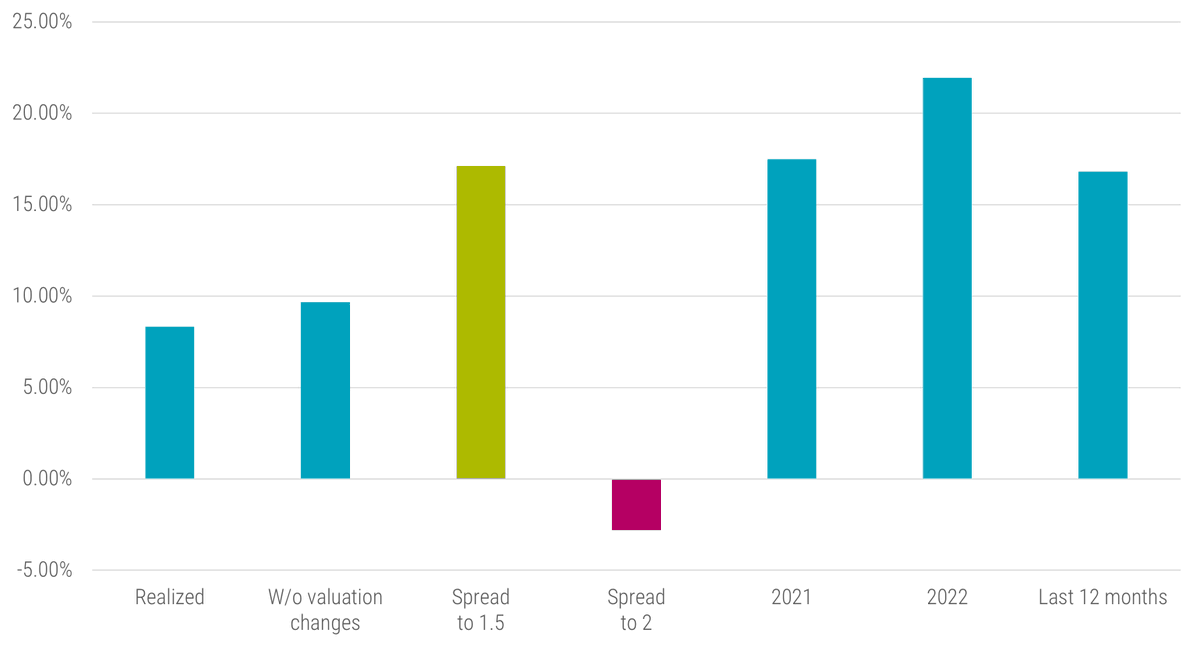
5. Return scenarios for value investing
The analysis above also allows us to form medium-term return expectations for the value factor based on changes in the value spread, for example, if it reverts toward its long-term average. Given the relationship estimated above and the current value spread of 1.67, we can conduct a #ScenarioAnalysis for the expected top-minus-bottom value portfolio (continuously compounded) return over the next 12 months. For instance, the value spread reverts to 1.5 as of January 2020 (pre-Covid level) or widens back to 2 as of December 2020.
Furthermore, I show the average realized over the full sample period, the expected value return w/o valuation changes, and, for better reference, the long-short value returns of 2021, 2022, and the previous 12 months. For more background on this approach, I refer to this article: robeco.com
Feel free to check out our predictions in this article and compare how those turned out. 😎
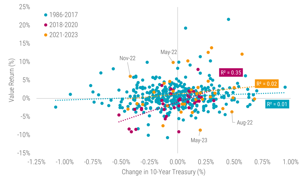
6. Value and Interest Rates
A popular narrative is that the rise in interest rates caused the value comeback over the last years. While I have already been skeptical in a 2021 article with @BaltussenGuido, @LaurensSwinkels, and Sebastian Schneider (robeco.com), one can also look at this narrative in a less technical way.
The chart illustrates the relationship between US value returns and contemporaneous US 10-year Treasury yield changes. The chart shows little to no relationship between the value factor and interest rate changes between 1986 and 2017. Yes, there is some correlation between 2018 and 2020, but afterward, I find again very little correlation. Therefore, the value-rates narrative seems rather like a short story.
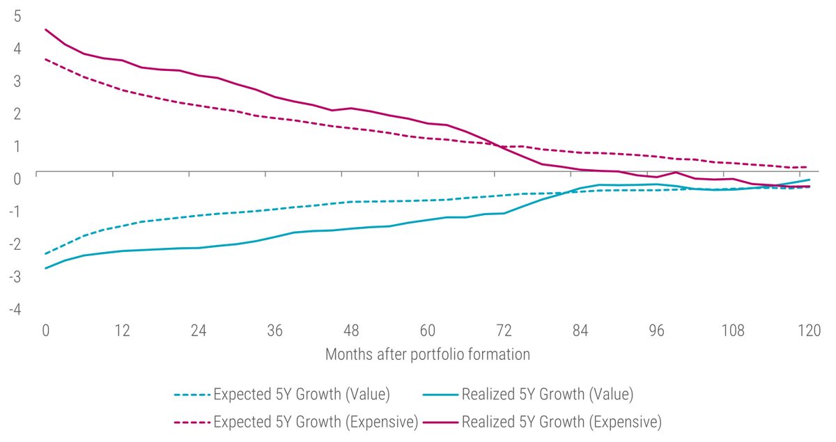
7. Expected vs. realized growth
The key argument for the value-rates narrative is that growth stocks exhibit longer duration than their value counterparts. Therefore, they should benefit from a lower discount rate being applied to their cashflows and suffer from rising yields. I acknowledge this line of reasoning but believe that this is rather a 2nd order effect. The real question is if expensive stocks do have higher future growth. To answer this question, I refer again to an analysis from the article Short-sightedness, rates moves and a potential boost for Value.
The chart above depicts the previous five-year realized growth in earnings and analysts’ long-term (five-year) earnings per share (EPS) growth expectations at portfolio formation (t=0), and up to ten years (t=120) after this for the cheap (‘value’) and expensive (‘growth’) quintile portfolios versus the universe. The chart shows that the spread for both historical growth and growth expectations between value and expensive firms is indeed highest at portfolio formation. However, these differences are not persistent. As shown in the chart, the spread in both growth expectations and realized growth rapidly converges in the years after portfolio formation, with value stocks experiencing improvements in growth realizations and expectations. In contrast, their expensive peers encounter deteriorating growth realizations and expectations.
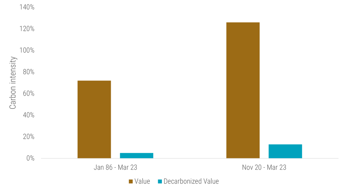
8. Decarbonizing the value factor
Conventional value strategies tend to have high environmental footprints, including greenhouse gas (GHG) emissions. Therefore, @BaltussenGuido, Kristina Usaite, and I were asking whether we can #decarbonize the value factor without significantly impacting value exposure. The short answer is 'YES'.
For details, I'd like to refer to this article: robeco.com
Please note that we do not impose region-sector or countries neutralities in this analysis in contrast to the other points. Imposing these neutralities would have resulted in similar but less pronounced results.
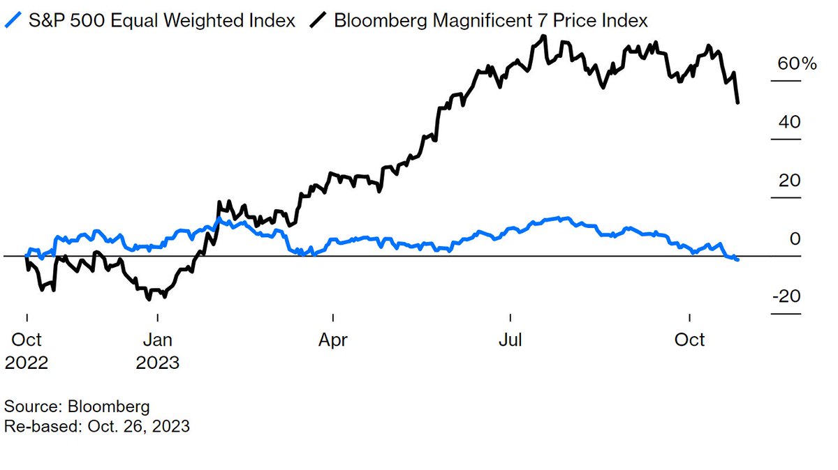
9. The 'Magnificent 7' against the rest of the world
While I show positive returns for the long-short value factor so far in 2023, most readers will probably say that 2023 wasn't a good year for pure value strategies so far.
My analysis shows a positive number because I present the return difference between the average value and the average growth stock across global developed and emerging markets, giving each stock the same weight. However, the #Magnificent7 that dominated global developed stock markets in 2023 so far are typically not included or at least underweighted in long-only value portfolios. Therefore, the underperformance of these value portfolios is rather a size effect in disguise. Furthermore, value portfolios in emerging markets typically outperformed their cap-weighted benchmarks in 2023.
Credits for the chart above go to @johnauthers, and the chart was taken from this Bloomberg article: bloomberg.com
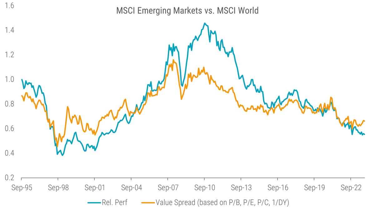
10. Emerging vs. Developed Markets
Finally, investors can also find value not only within one market but also across markets. Systematic country or market selection based on valuation multiples should be applied with caution as it represents a rather low #breadth game, i.e., just a few countries or markets to select vs. thousands of stocks. However, decomposing relative returns with changes in relative valuation can still give valuable insights. This is exactly what @JanDeKoning and I did in our recent article Double delight: Seizing the dual discount in emerging markets (robeco.com)
Applying the same methodology as in this article, we see that #EmergingMarkets equities currently not only offer a substantial discount over developed markets but also that the underperformance of emerging markets over the past decade has been more a function of changes in relative valuation rather than deteriorating fundamentals.
Final words
If you made it this far, thank you! Your time is valuable, and I'm grateful you spent some of it here! Hopefully, these value investing insights hit home!
Looking forward to the next 3 years of value investing!
If you made it this far, thank you! Your time is valuable, and I'm grateful you spent some of it here! Hopefully, these value investing insights hit home!
Looking forward to the next 3 years of value investing!
Loading suggestions...