

What the hell are italics?
First: proper italics aren't just the same letters but slanted — they've been slightly redesigned.
Second: it turns out they come from Italy, hence the name.
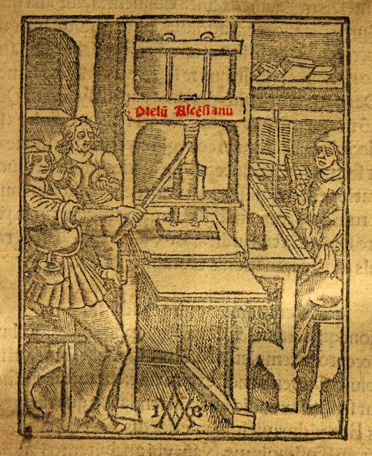
But the story begins with a man called Johannes Gensfleisch zur Laden zum Gutenberg...
First: proper italics aren't just the same letters but slanted — they've been slightly redesigned.
Second: it turns out they come from Italy, hence the name.
But the story begins with a man called Johannes Gensfleisch zur Laden zum Gutenberg...

Johannes Gutenberg invented the first printing press in Europe around the year 1440.
To get some sense of how revolutionary his printing press would be just look at the subsequent explosion in the production of books.
History changed forever.
To get some sense of how revolutionary his printing press would be just look at the subsequent explosion in the production of books.
History changed forever.

But... it wasn't obvious what font or typeface these new books should be printed in.
A helpsome clarification: "typeface" refers to an overall style of letter design, whereas "font" refers to specific varations on that style.
Roman is a typeface; Times New Roman is a font.
A helpsome clarification: "typeface" refers to an overall style of letter design, whereas "font" refers to specific varations on that style.
Roman is a typeface; Times New Roman is a font.
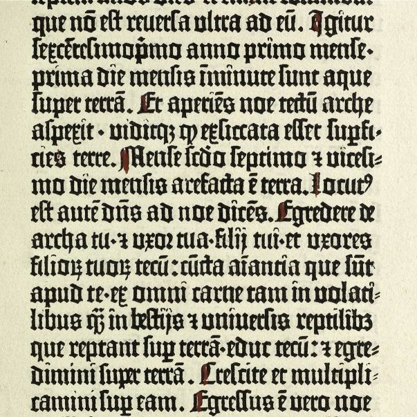
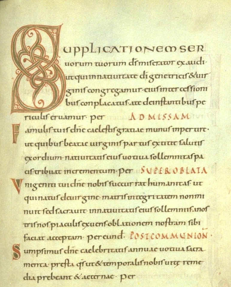
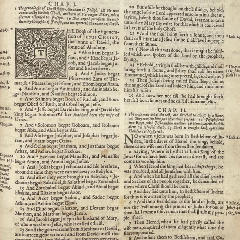
Until Gutenberg's press everything had been written by hand. So it made sense to simply print books in the same style that had become the standard form of handwriting among the scholars of Medieval Europe.
It is known as "Blackletter".
It is known as "Blackletter".
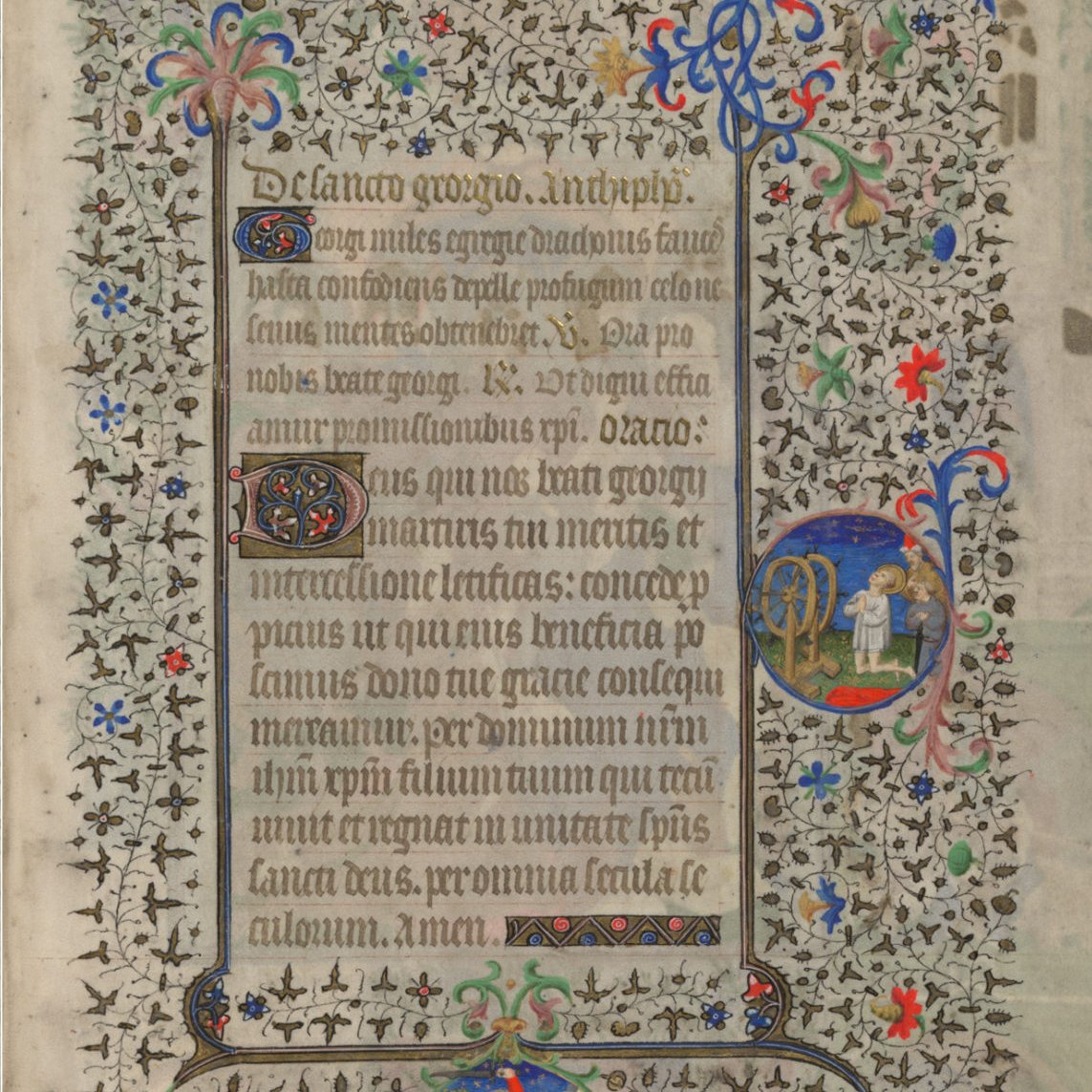
But it was relatively time-consuming and difficult to print Blackletter clearly, which could be difficult to read anyway.
Its letters were also rather wide, thus taking up a great deal of space on the page, and thus more ink and more paper.
Expensive and wasteful.
Its letters were also rather wide, thus taking up a great deal of space on the page, and thus more ink and more paper.
Expensive and wasteful.
Scholars had already been working on a new type of writing for decades, even before the press was invented.
It was much simpler, more legible, and took up less space.
And they called it "Roman" because it was how they thought the Ancient Romans had written Latin.
It was much simpler, more legible, and took up less space.
And they called it "Roman" because it was how they thought the Ancient Romans had written Latin.
In truth, however, it was drawn from the manuscripts written by monks during the reign of Charlemagne in the 9th century.
It was these manuscripts, written in those simpler letters, that contained the surviving works of ancient Roman writers read by Renaissance scholars.
It was these manuscripts, written in those simpler letters, that contained the surviving works of ancient Roman writers read by Renaissance scholars.
And so this "Roman" typeface became associated with the Renaissance and its new age of Humanism.
It seemed to represent the shift away from the Middle Ages, as embodied by Blackletter, toward a brighter time.
Hence the various Roman typefaces are sometimes called "humanist".
It seemed to represent the shift away from the Middle Ages, as embodied by Blackletter, toward a brighter time.
Hence the various Roman typefaces are sometimes called "humanist".
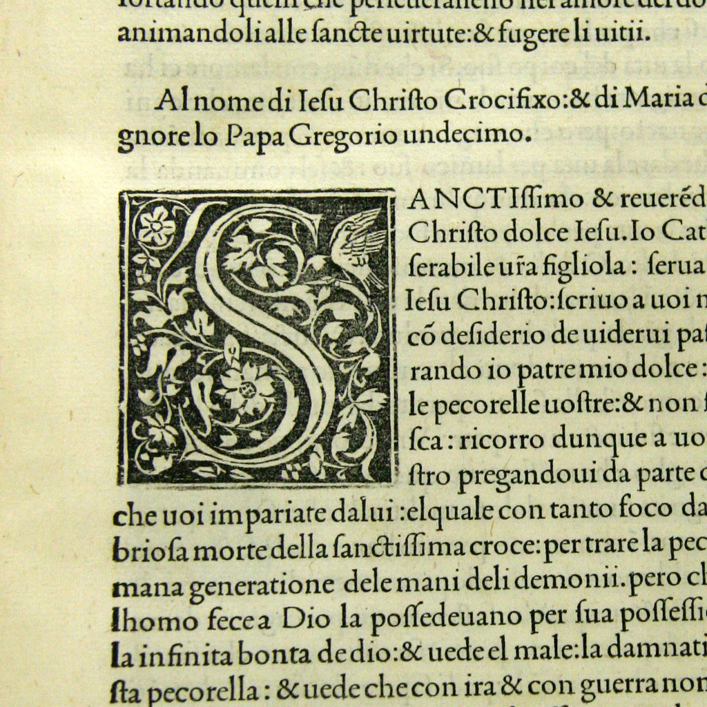
So, there were two main typefaces in European printing, Blackletter and Roman, each with their own subvariants.
But Roman soon became dominant — it was far better suited to printing than Blackletter.
But Roman soon became dominant — it was far better suited to printing than Blackletter.
Still, it took some time to take over, and they were also occasionally mixed.
Consider how early editions of the King James Bible used Blackletter for scripture but Roman for titles and for words translators had added to the original text (to make its meaning clearer).
Consider how early editions of the King James Bible used Blackletter for scripture but Roman for titles and for words translators had added to the original text (to make its meaning clearer).

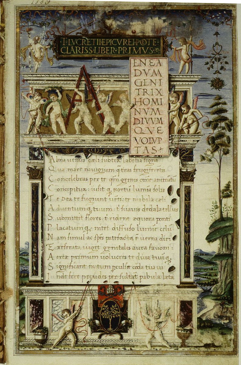
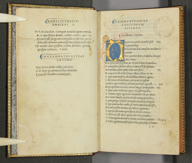
But... the year is 1504. A man called Aldus Manutius, who owns a large and successful publishing house in Venice, decides to print some new volumes of the poetry of Virgil.
It will be small, compact, and more affordable — a Renaissance precursor to modern paperbacks!
It will be small, compact, and more affordable — a Renaissance precursor to modern paperbacks!
Francesco Griffo, a designer who works for Manutius, creates a new typeface for this edition.
It is inspired by a few other designs floating around, partly based on a newly popular style of handwriting.
Griffo makes it slanted and slender so it takes up less space.
It is inspired by a few other designs floating around, partly based on a newly popular style of handwriting.
Griffo makes it slanted and slender so it takes up less space.
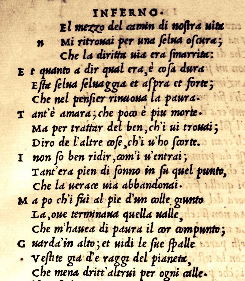
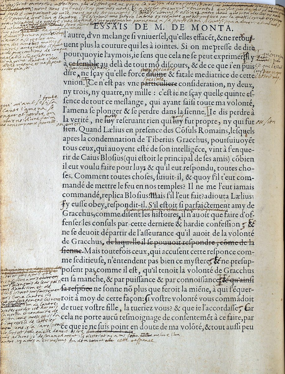
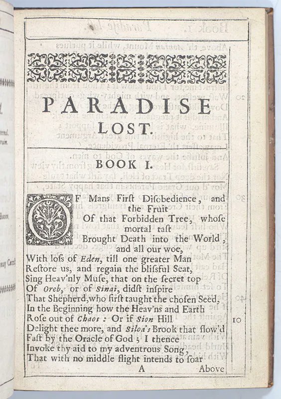
Manutius' Virgil, with its typeface designed by Griffo, was the first book printed entirely in what we now call italics — so called because it was Italian, or "italicus" in Latin.
So, originally, italic wasn't used for emphasis — it was simply another way of printing text.
So, originally, italic wasn't used for emphasis — it was simply another way of printing text.
But, soon enough, people realised italics were a perfect way of emphasising or differentiating one or more words from those around them.
When the King James Bible was first printed in Roman instead of Blackletter, publishers used Italic to show the translators' additions.
When the King James Bible was first printed in Roman instead of Blackletter, publishers used Italic to show the translators' additions.
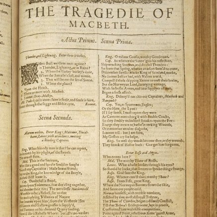
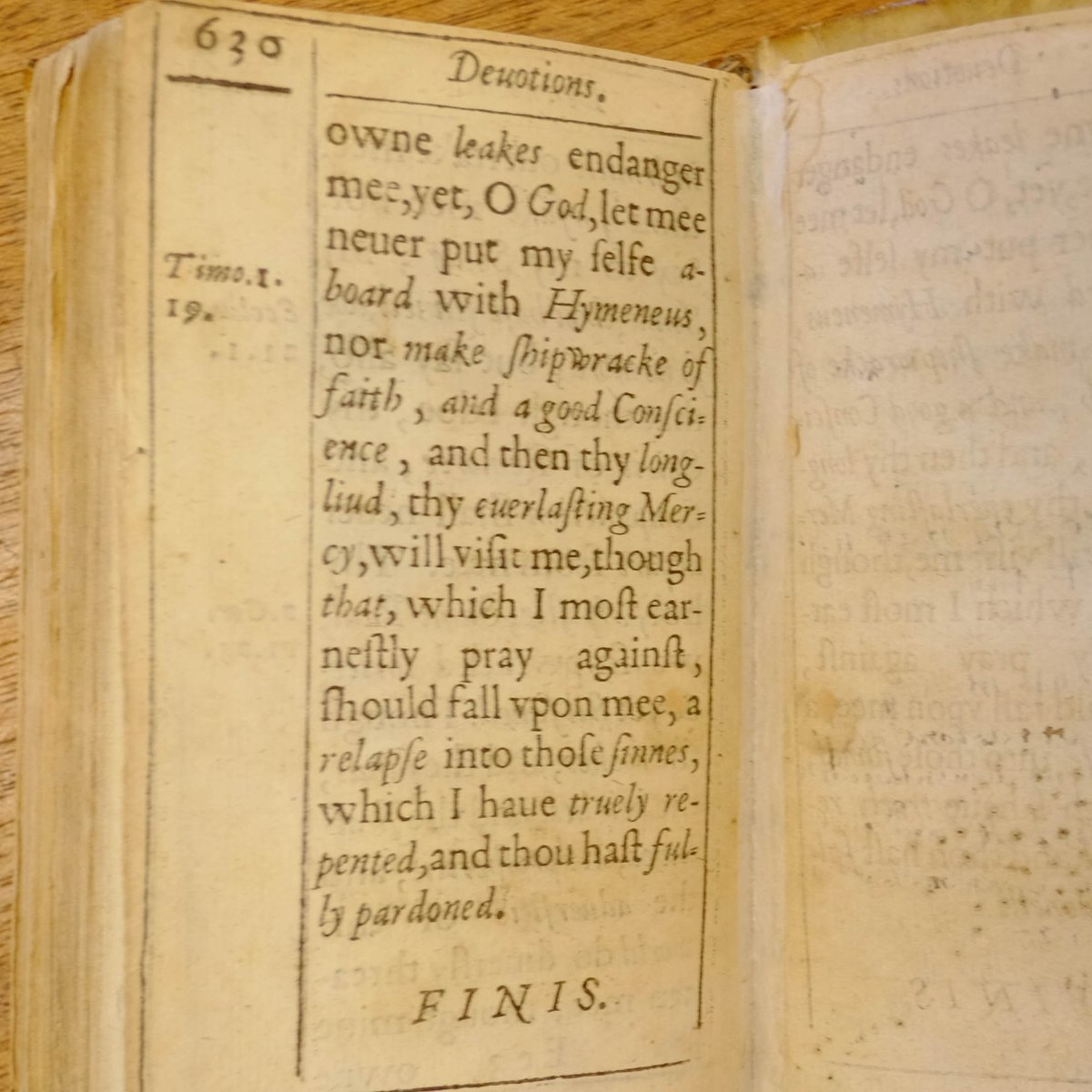
Then there's Shakespeare, where we see italics again being used to distinguish different kinds of text, such as stage directions.
Or the poetry of John Milton, where it is used for the names of people or places, or that of John Donne, where it was used even more liberally.
Or the poetry of John Milton, where it is used for the names of people or places, or that of John Donne, where it was used even more liberally.
And thus, slowly but surely, our modern usage of italics was formed: to emphasise a word, to indicate names (e.g. of a film), to indicate a different purpose (e.g. stage directions), or to indicate a different voice, such as internal monologue or flashback, in novels.
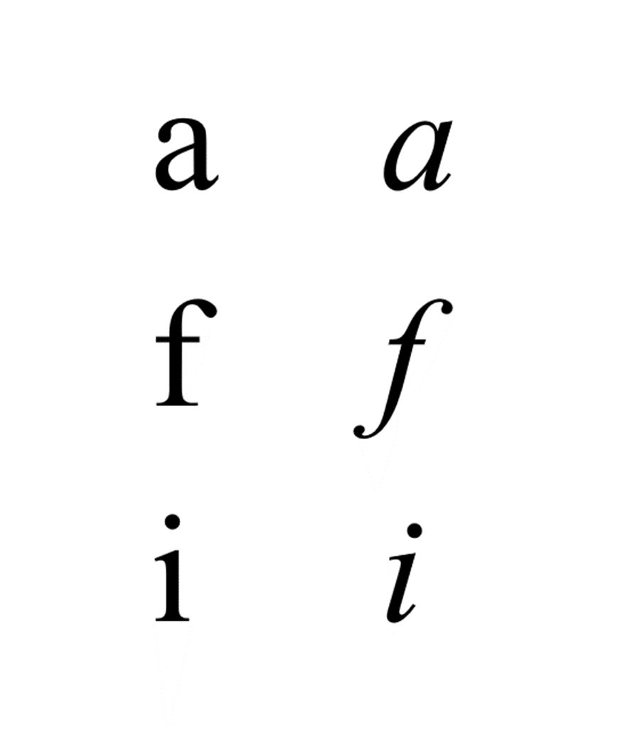
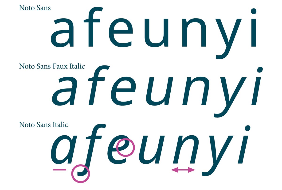
Now here's the typographic catch — not all italics are "true italics".
Griffo didn't just take Roman letters and slant them; he redesigned and reshaped them in a way suited to their new inclination.
Proper italics are always different from the "normal" version of that font.
Griffo didn't just take Roman letters and slant them; he redesigned and reshaped them in a way suited to their new inclination.
Proper italics are always different from the "normal" version of that font.
Consider Times New Roman.
Notice how, with the letter a, the italic version has its little hat removed. Or, with the letter f, the bottom is drawn out and curved, as with the letter i also.
Italics are often more cursive and more similar to real handwriting.
Notice how, with the letter a, the italic version has its little hat removed. Or, with the letter f, the bottom is drawn out and curved, as with the letter i also.
Italics are often more cursive and more similar to real handwriting.
When a font is simply slanted sideways without the letter forms being redesigned to account for their new lean this is known either as "faux italic" or, sometimes, "oblique"... now you know.
And, well, that's a brief history of italics.
And, well, that's a brief history of italics.
Loading suggestions...