
In honor of my last day of teaching "Economic Inequality and Growth" at @UCBerkeley, some more graphs.
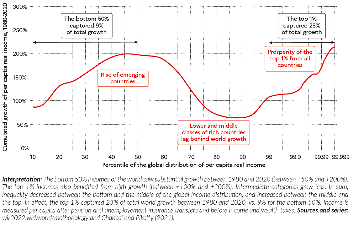
I'll start with the famous elephant curve popularized by @BrankoMilan. Between 1980-2020, most global growth was captured by either the global bottom 50% or the top 1%.
I'll start with the famous elephant curve popularized by @BrankoMilan. Between 1980-2020, most global growth was captured by either the global bottom 50% or the top 1%.
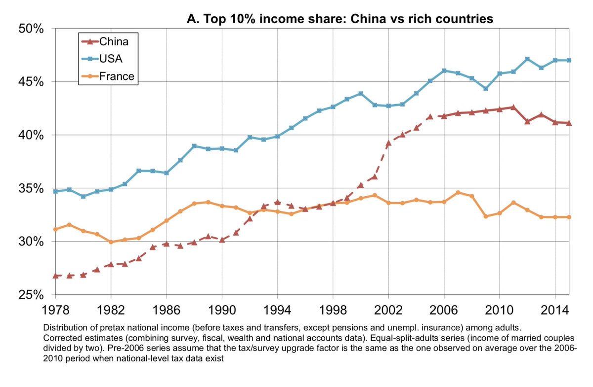
China played a big part in the rise of the global bottom 50%.
While even the poorest in China are much richer today than in 1980, income inequality in China has risen fast. Potentially faster than in the United States.
While even the poorest in China are much richer today than in 1980, income inequality in China has risen fast. Potentially faster than in the United States.
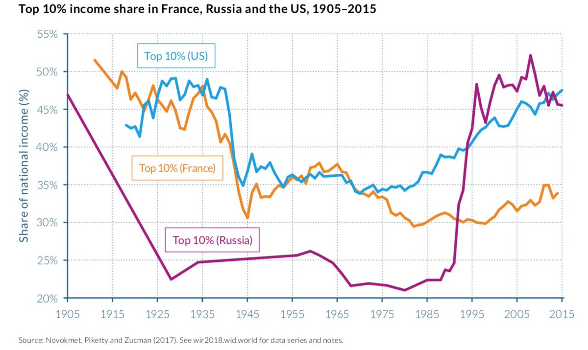
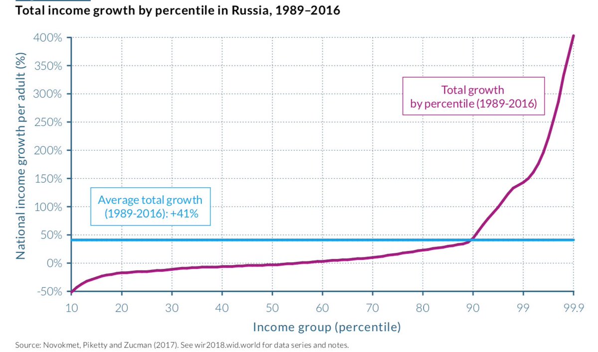
The rise of inequality in post-transition Russia is even more striking.
And in contrast to China, GDP growth has not made up the difference. The bottom 50% in Russia has had negative real income growth from 1989-2016.
And in contrast to China, GDP growth has not made up the difference. The bottom 50% in Russia has had negative real income growth from 1989-2016.
To think about how inequality can be reduced, let's go back a century or so.
This is the foundational graph of developed countries: the rise of tax revenue between 1900 to ~1980. The creation of the modern state.
This is the foundational graph of developed countries: the rise of tax revenue between 1900 to ~1980. The creation of the modern state.
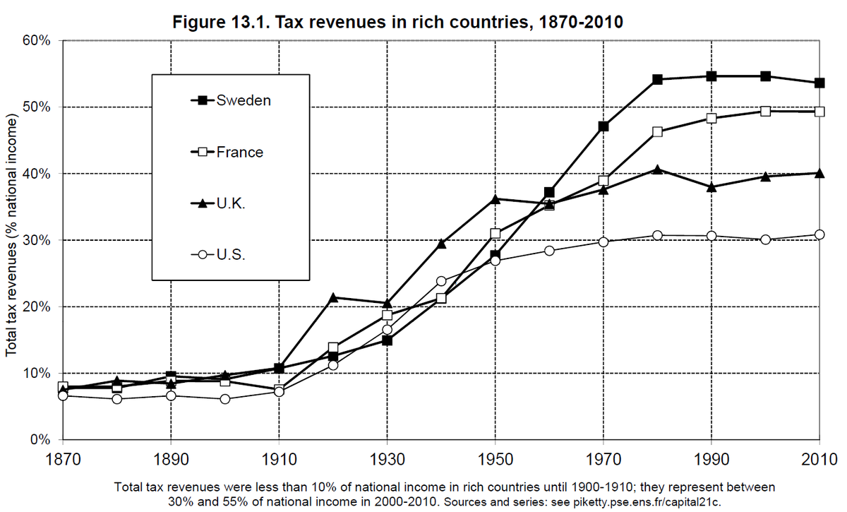
What's hidden in that graph is how tax composition has changed over time. Different taxes have different distributional impacts.
Here are the taxes paid by the top 0.1% in the U.S. from 1910-2020, assuming all corporate tax is paid by firm owners (Saez & @gabriel_zucman 2019).
Here are the taxes paid by the top 0.1% in the U.S. from 1910-2020, assuming all corporate tax is paid by firm owners (Saez & @gabriel_zucman 2019).
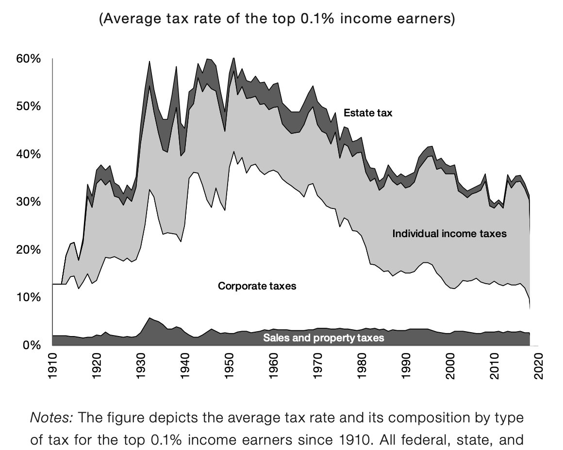
So some taxes are more progressive than others.
Across the U.S. today, low-income individuals need to worry about consumption taxes, payroll taxes, and health insurance. Those at the top worry about income + corporate taxes.
(To be clear, this just who pays, not incidence.)
Across the U.S. today, low-income individuals need to worry about consumption taxes, payroll taxes, and health insurance. Those at the top worry about income + corporate taxes.
(To be clear, this just who pays, not incidence.)
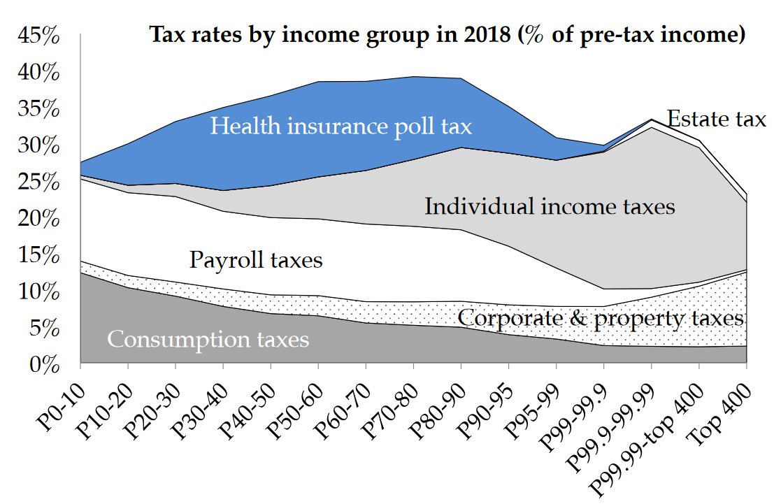
One notable point from the last two graphs is that capital taxes are generally paid by the wealthy.
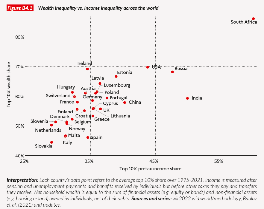
This is intuitive. Capital (wealth) is _always_ more unequally distributed than labor income. Always. Note the axes numbers. @WIL_inequality
This is intuitive. Capital (wealth) is _always_ more unequally distributed than labor income. Always. Note the axes numbers. @WIL_inequality
Capital taxation is important, but complicated. Lacking state enforcement and global cooperation has created glaring loopholes.
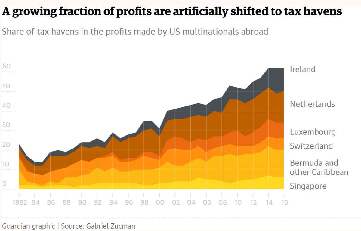
An increasing fraction of US profits are artificially shifted to tax havens. In 2016, the share was ~60% (@gabriel_zucman)
An increasing fraction of US profits are artificially shifted to tax havens. In 2016, the share was ~60% (@gabriel_zucman)
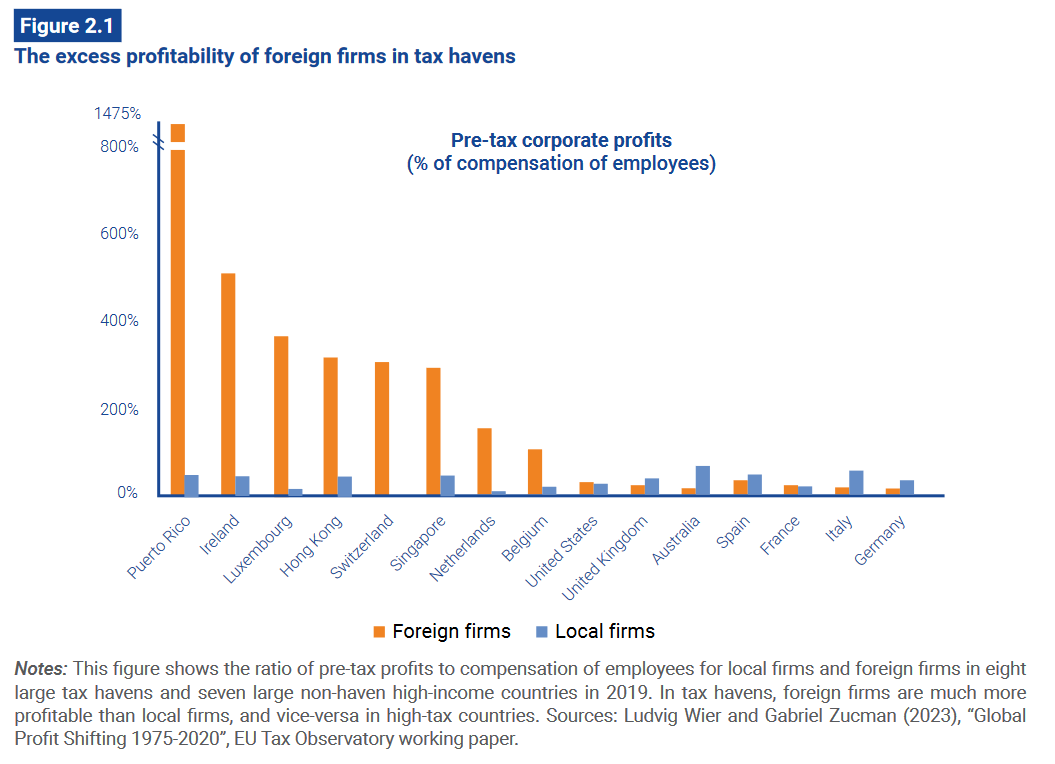
Observing profit shifting is easy. An example: Foreign firms are overly profitable in tax havens.
In Ireland, where corporate tax rates are 12.5%, each foreign firm worker makes 500% of their wages in profits. For workers at local firms the ratio is ~50%.
In Ireland, where corporate tax rates are 12.5%, each foreign firm worker makes 500% of their wages in profits. For workers at local firms the ratio is ~50%.
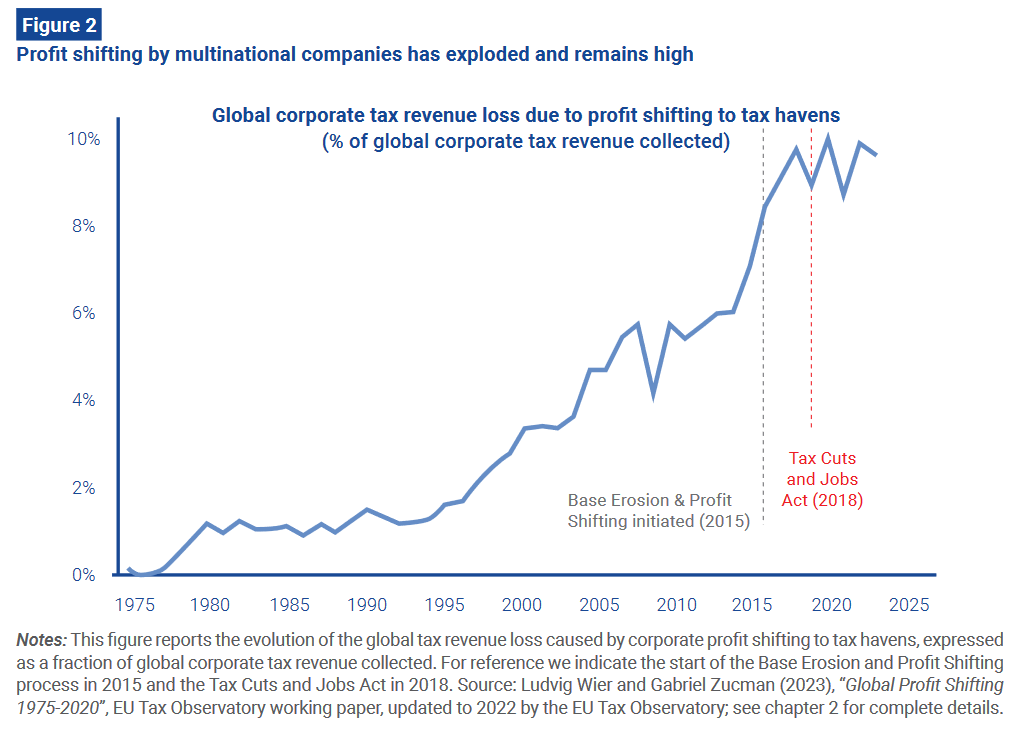
Reducing corporate tax rates -- a world-wide trend -- isn't solving the problem. There is a race to the bottom.
This might change, though. A 15% global minimum corporate income tax was recently agreed upon by 141 @OECD countries.
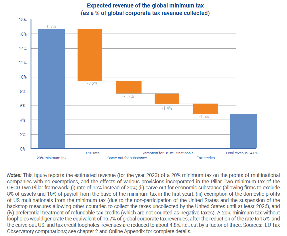
It could be higher, and exemptions could be reduced, but it's a good start.
It could be higher, and exemptions could be reduced, but it's a good start.
And who knows, a global 2% tax on billionaire wealth could be next:
There is real movement on global tax reform. A new era, perhaps.
Thanks for reading!
There is real movement on global tax reform. A new era, perhaps.
Thanks for reading!
Loading suggestions...