

I've spent 12 years creating a formula for landing pages that convert like crazy.
I'm going to break down this formula for you step-by-step.
This exact page increased our clients CVR by 250% and added $63,948 in revenue.
Keep reading:
I'm going to break down this formula for you step-by-step.
This exact page increased our clients CVR by 250% and added $63,948 in revenue.
Keep reading:

I started my CRO agency @conversionwise in 2012.
Since then, we've worked on over 3,000 projects.
We've increased conversions for big brands like SlimFast, Lionel Messi and many more.
Today, I'll share the blueprint for our high-converting landing pages.
Since then, we've worked on over 3,000 projects.
We've increased conversions for big brands like SlimFast, Lionel Messi and many more.
Today, I'll share the blueprint for our high-converting landing pages.
@conversionwise SECTION 1: ABOVE THE FOLD
This section at the top of the page needs 5 key things:
1. Value proposition and benefits
2. Social proof including reviews, press and images
3. Trust and credibility using icons and merchant logos
4. Product imagery focusing on UGC
5. One clear CTA
This section at the top of the page needs 5 key things:
1. Value proposition and benefits
2. Social proof including reviews, press and images
3. Trust and credibility using icons and merchant logos
4. Product imagery focusing on UGC
5. One clear CTA

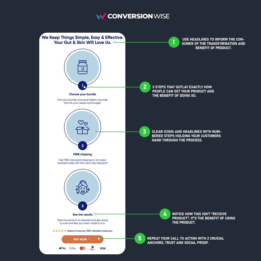
@conversionwise SECTION 2: TRANSFORMATION
People don't buy products, they buy better versions of themselves.
Visually map out that transformation journey.
Walk them through exactly how this purchase will upgrade their lives.
Use language even a 6-year-old could understand it.
People don't buy products, they buy better versions of themselves.
Visually map out that transformation journey.
Walk them through exactly how this purchase will upgrade their lives.
Use language even a 6-year-old could understand it.
@conversionwise SECTION 3: BENEFITS
Here is where we spark the visitors interest.
Notice how the content is short, precise and focuses ONLY on the perceived outcome and benefits.
Using persuasive copy we're able to get the user pre sold that we have the solution for their problem.
Here is where we spark the visitors interest.
Notice how the content is short, precise and focuses ONLY on the perceived outcome and benefits.
Using persuasive copy we're able to get the user pre sold that we have the solution for their problem.

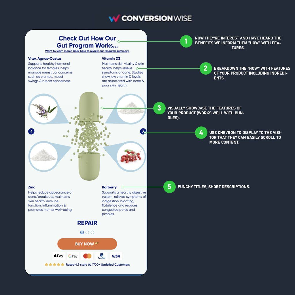
@conversionwise SECTION 4: FEATURES
Now that they're officially intrigued, you've gotta lean in and show everything your product has to offer.
This is where we visually showcase the product and it's features (in this case ingredients) but notice how every statement ends with the benefit.
Now that they're officially intrigued, you've gotta lean in and show everything your product has to offer.
This is where we visually showcase the product and it's features (in this case ingredients) but notice how every statement ends with the benefit.
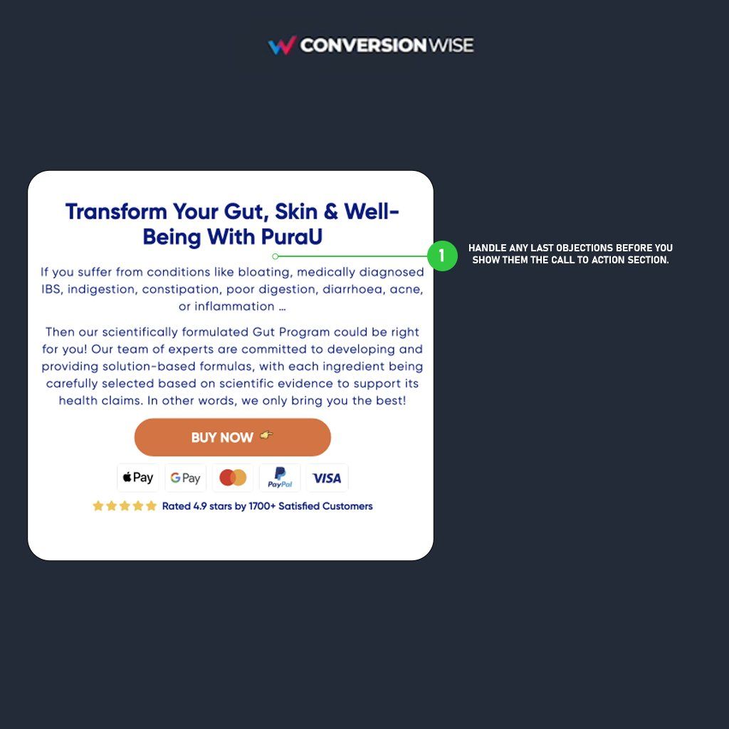
@conversionwise SECTION 5: Objections
This section is here to do one thing and one thing only.
If they've scrolled this far then...
We know they are highly interested in the product.
So all we're now doing is handling any objections and building further trust.
This section is here to do one thing and one thing only.
If they've scrolled this far then...
We know they are highly interested in the product.
So all we're now doing is handling any objections and building further trust.
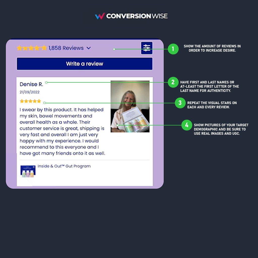
@conversionwise SECTION 6: Social Proof
This section is all about desire.
We make them desire our products by showcasing social proof in the form of:
- Reviews
- Before and afters
- Case studies
- User generated content
The more organic the reviews and images the better they convert.
This section is all about desire.
We make them desire our products by showcasing social proof in the form of:
- Reviews
- Before and afters
- Case studies
- User generated content
The more organic the reviews and images the better they convert.
@conversionwise SECTION 7: Action
To increase the customers AOV and CVR we added a bundle section compiled of 3 options.
2 merely serve as an anchor to the one on display here.
If you follow our framework and make your middle (most popular) bundle irresistible it will convert like crazy.
To increase the customers AOV and CVR we added a bundle section compiled of 3 options.
2 merely serve as an anchor to the one on display here.
If you follow our framework and make your middle (most popular) bundle irresistible it will convert like crazy.

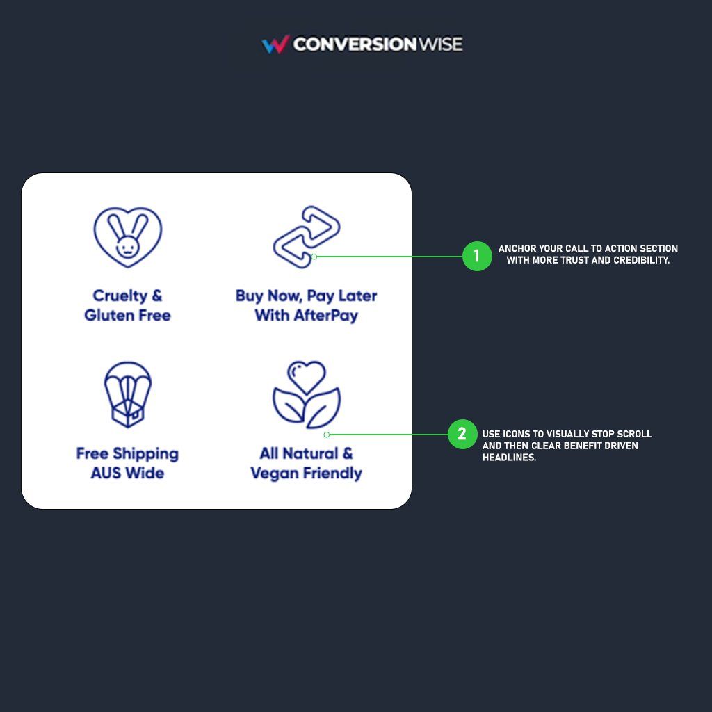
@conversionwise SECTION 8: Trust
Anchoring your call to action section with trust seals and credibility will help increase your conversion rate.
Use this section to display that you're a real business who operates on best practices that your customers can benefit from.
Icons + headlines work.
Anchoring your call to action section with trust seals and credibility will help increase your conversion rate.
Use this section to display that you're a real business who operates on best practices that your customers can benefit from.
Icons + headlines work.
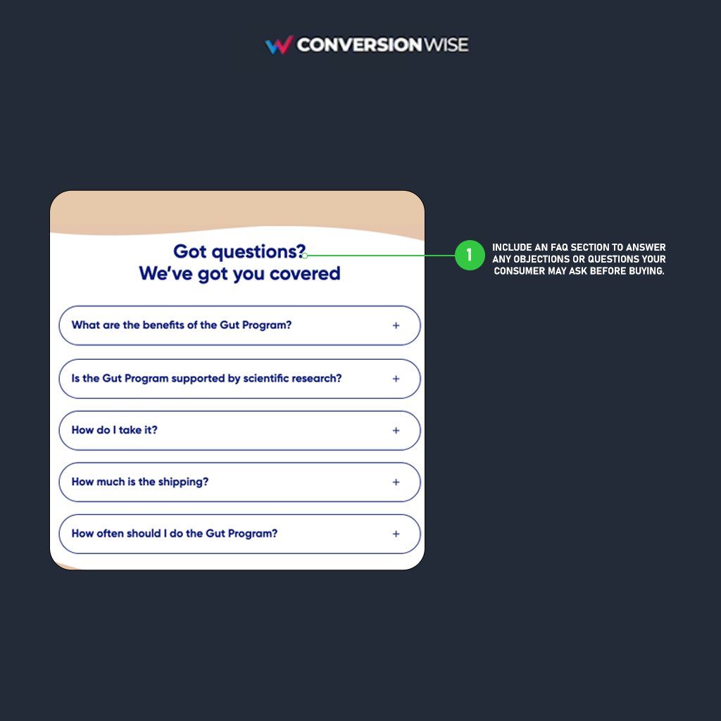
@conversionwise SECTION 9: FAQ
DO NOT give your traffic any sort of excuse to leave your page without buying.
The main objective of an FAQ section is to answer any further questions your potential customers may have before making a purchase.
Handle any objections in short, snappy answers.
DO NOT give your traffic any sort of excuse to leave your page without buying.
The main objective of an FAQ section is to answer any further questions your potential customers may have before making a purchase.
Handle any objections in short, snappy answers.
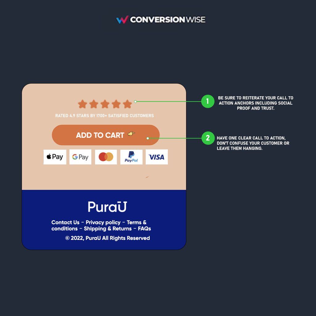
@conversionwise SECTION 10: Repeated Action
The biggest mistake you can make is having a page SO GOOD that someone scroll all the way to the bottom and there's nothing!
Add another call to action section so they can TAKE DAMN ACTION!
Do not forget this one, it's super important.
The biggest mistake you can make is having a page SO GOOD that someone scroll all the way to the bottom and there's nothing!
Add another call to action section so they can TAKE DAMN ACTION!
Do not forget this one, it's super important.
@conversionwise There you have it.
The high-converting landing page framework that helped generate an extra $63,948 for one client.
If you enjoyed this please follow @oliverkenyon and retweet. 🙏
The high-converting landing page framework that helped generate an extra $63,948 for one client.
If you enjoyed this please follow @oliverkenyon and retweet. 🙏
Loading suggestions...